CSS-only Carousel

Motivation
Recently I was playing with the new ::scroll-button() and ::scroll-marker() in Chrome. I was reminded of a CSS experiment I did a few years back (maybe 2020?) where I made a CSS-only carousel.
I frequently look for ways to replace my Javascript with CSS. Is it always a good idea? No. Is it always possible? No. But often I do find some components that have a CSS equivalent where the benefits outweigh the downsides. Now some modern front-end developers will seriously question why replace JS with CSS, and I get that. If you are already writing everything in JS, what’s one more library and a few lines of config? For some projects, a JS library makes sense. Especially considering the constantly changing landscape of browser support.
However, using CSS for some components improves page performance as it’s run on a different thread than JS. It is already optimized for smooth transitions, and 3D transformations are automatically shipped off to the GPU. While the performance improvements may be negligible compared to a JS library, there are many sites that would benefit from quicker load times, even if it’s only a few hundred milliseconds. We’ll explore both the benefits and the downsides of this CSS-only approach.
With some universally supported CSS, some hidden HTML form elements to maintain state, and some basic markup, we can build a nice image carousel without any Javascript.
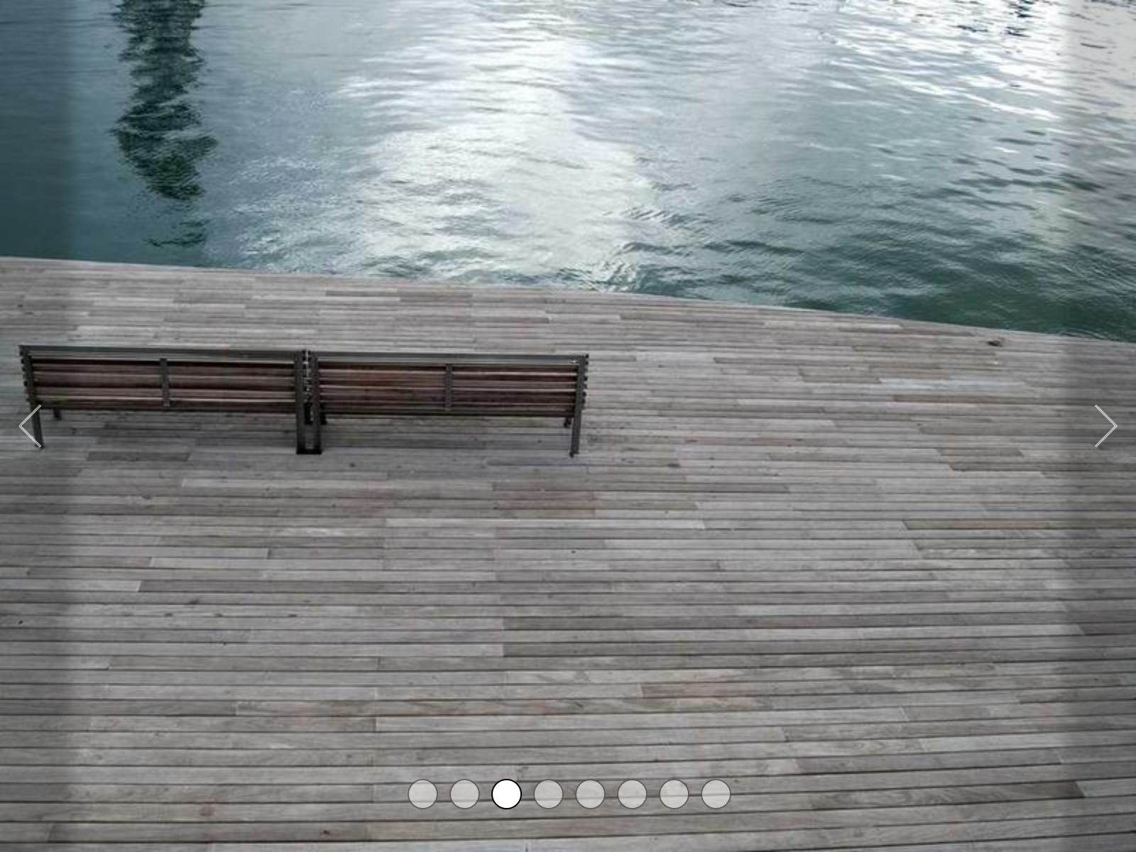
Here’s a screenshot of what we’ll be building:

The Basics
One of the tradeoffs of using CSS instead of JS is the CSS needs to style based on state. The more states there are, the more CSS branches there will need to be. In this case, we will have a sequence of images of which one will be shown at once. So we’ll have as many states as images.
To help maintain clean code, I’m going to use slim and sass for this project. If you haven’t used slim before, it’s basically HTML without closing tags or angle brackets and it uses indentation to determine nesting. And it’s lovely. The CSS equivalent is sass, which is nested CSS without semicolons and curly braces. Each have a few other features we’ll see in this project such as assigning and using variables.
Let’s define a basic page and a few images.
- slides = [ \
  'https://picsum.photos/id/76/800/600', \
  'https://picsum.photos/id/77/800/600', \
  'https://picsum.photos/id/87/800/600', \
  'https://picsum.photos/id/110/800/600', \
  'https://picsum.photos/id/128/800/600', \
  'https://picsum.photos/id/159/800/600', \
  'https://picsum.photos/id/197/800/600', \
  'https://picsum.photos/id/217/800/600', \
]

doctype html
html
  head
    title CSS-only Carousel
    link rel="stylesheet" href="style.css"

  body
    #carousel
      - slides.each do |slide|
        .carousel-slide
          img src=slide
Thanks to Picsum for providing images for this project.
This basic structure will render a blank page, and that’s boring. Let’s loop through our images and render each.
This introduces another feature of slim which is control functions. If you have repetative HTML, you can use various methods to simplify the source code.
Now you can scroll down to see all the images. Feel free to swap out the :id (the first integer parameter in the Picsum url) for some that you’d like to work with. Let’s add some basic layout styles so the images are in a carousel-ish format.
body, html
  width: 100vw
  height: 100vh

body
  display: flex
  justify-content: center
  align-items: center
  margin: 0

#carousel
  width: 100%
  max-width: 800px
  aspect-ratio: 4/3
  overflow: hidden
  position: relative
  padding: 30px 5%
  box-sizing: border-box
  display: flex
  align-items: flex-end
  justify-content: center
  flex-wrap: wrap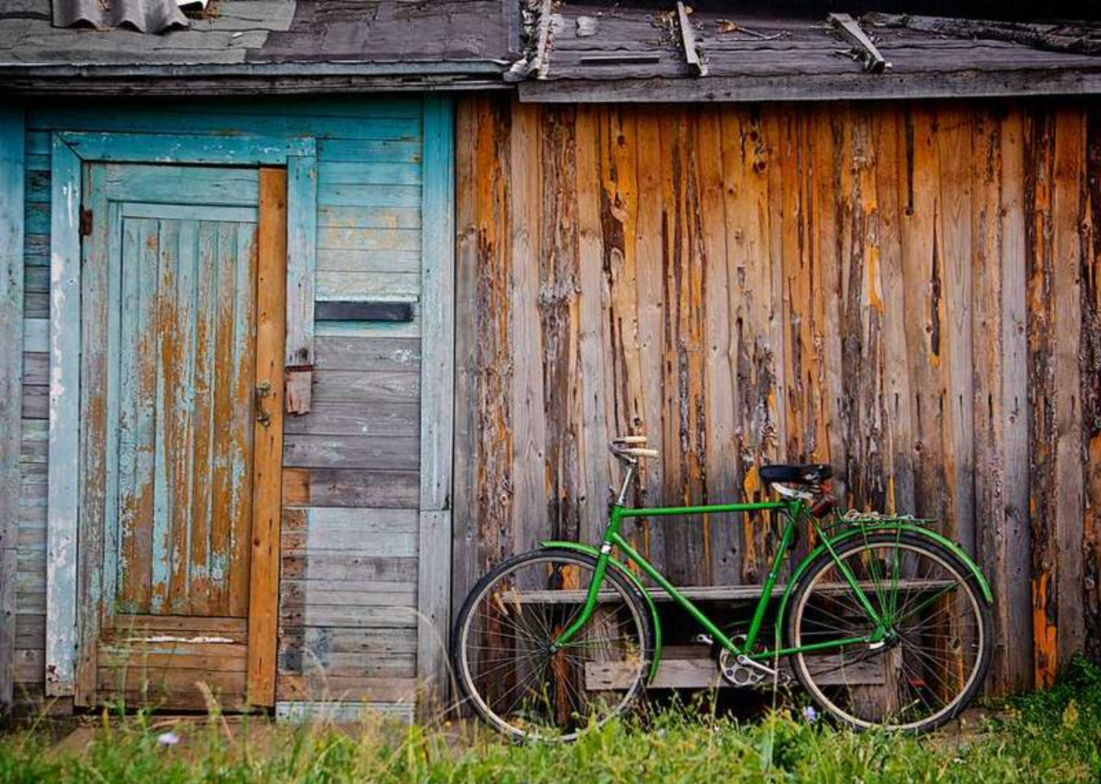
Carousel Structure
The basic idea of this carousel is to have all the slides placed in a horizontal row. The row will then shift by 100% to move to the next slide. To facilitate this we’ll need to have a ‘frame’ which defines the viewable area, a container to hold all the slides which can shift left and right, and slides which are all the same size.
Let’s adjust our HTML body to the following:
  body
    #carousel
      #carousel-container
        #carousel-slides
          - slides.each_with_index do |slide, index|
            img src=slide
With a little bit of CSS we’ll be ready to make this much more interesting:
#carousel-container
height: 100%
width: 100%
position: absolute
top: 0
left: 0
transition: left 0.3s ease-in-out
#carousel-slides
display: flex
width: max-content
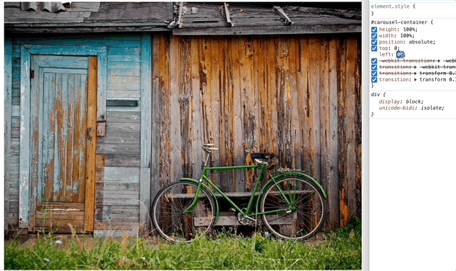
height: 100%If you inspect the DOM and adjust the left attribute of the #carousel-container you will notice the other images scroll into view.
It’s time to add some controls to make it easier to see the other images.
State Management
To allow the user to control which image is currently shown, we need something to hold their chosen state. If we didn’t want the user to control the flow, we could add some CSS animations to control the left attribute and it would cycle through the images. However, we want this to be a choose-your-own-adventure type carousel.
Since only one image will be shown at once, and exactly one image will be shown at once, radio buttons will work best for maintaining state. Let’s add some radio buttons to the #carousel div, and style them so they look like carousel navigation markers.
Here we add a new loop over the slides array to create the radio buttons. It’s important that the radio buttons be adjacent to the #carousel-container so that we can select it easily with CSS (without :has()).
  body
    #carousel
      - slides.each_with_index do |slide, index|
        input type="radio" name="carousel" id="carousel-#{index}" checked=(index == 0)

      #carousel-container
        #carousel-slides
          - slides.each_with_index do |slide, index|
            img src=slide
Now some magic Sass.
input[type="radio"]
  z-index: 1
  appearance: none
  width: 3%
  min-width: 15px
  max-width: 25px
  aspect-ratio: 1/1
  background-color: rgba(255, 255, 255, 0.5)
  cursor: pointer
  border-radius: 50%
  border: 1px solid rgba(0, 0, 0, 0.5)

  &:checked
    background-color: rgba(255, 255, 255, 1)
    border: 1px solid rgba(0, 0, 0, 1)

    @for $i from 1 through 8
      &:nth-child(#{$i}) ~ #carousel-container
        left: -($i - 1) * 100%
NOTE: This relies on CSS knowing how big the array of images is. There are lots of ways you could do this server-side, or just keep them in sync manually. This is one of the trade-offs of doing this with CSS vs JS. If your gallery is mostly static, CSS is still a great fit.
The code above styles the #carousel-container’s left attribute to match the index of the currently selected radio button. If the second radio button is selected (the slide at index 1), the offset is -100% - thus showing the second slide. It also styles the checked radio button to show it’s selected.

Next and Prev
As it is, the gallery works just fine. The user can click through the images by tapping on the navigation markers. But a lot of galleries have next and previous buttons so the user doesn’t have to move their mouse every time they want to see a different image. Adding those isn’t too difficult, but it does require some additional markup. Since we’re using radio buttons for state, we can add a label for each radio button, then cleverly hide and show them so the ‘next’ and ‘previous’ buttons always activate the correct radio button.
Adding next and prev button containers to the #carousel leaves our body looking like this:
  body
    #carousel
      - slides.each_with_index do |slide, index|
        input type="radio" name="carousel" id="carousel-#{index}" checked=(index == 0)

      #prev-buttons
        - slides.each_with_index do |slide, index|
          label for="carousel-#{index-1}"

      #next-buttons
        - slides.each_with_index do |slide, index|
          label for="carousel-#{index+1}"

      #carousel-container
        #carousel-slides
          - slides.each_with_index do |slide, index|
            img src=slide
The styles to show the next and prev buttons work like this:
#prev-buttons, #next-buttons
  position: absolute
  right: 0
  top: 0
  bottom: 0
  width: 5%
  background-color: rgba(0, 0, 0, 0.2)
  z-index: 10
  box-shadow: 0px 0 10px 10px rgba(0, 0, 0, 0.2)
  transition: background-color 0.1s ease-in-out, box-shadow 0.1s ease-in-out

  label
    display: none
    height: 100%
    cursor: pointer
    background-color: rgba(0, 0, 0, 0)
    transition: background-color 0.1s ease-in-out, box-shadow 0.1s ease-in-out

    &:before
      content: ""
      width: 50%
      aspect-ratio: 1/1
      border-top: 2px solid rgba(255, 255, 255, 0.5)
      border-right: 2px solid rgba(255, 255, 255, 0.5)
      border-radius: 5%
      position: absolute
      top: 50%
      left: 30%
      transform: translate(-50%, -50%) rotate(45deg)
      transition: opacity 0.1s ease-in-out
      opacity: 1

    &:hover
      background-color: rgba(0, 0, 0, 0.1)
      box-shadow: 0px 0 10px 10px rgba(0, 0, 0, .1)

#prev-buttons
  left: 0
  right: auto

  label:before
    left: 70%
    transform: translate(-50%, -50%) rotate(-135deg)
We also need to update the :checked state of the radio buttons to show/hide the correct labels depending on which slide is being shown
input[type="radio"]

  ... existing styles ...

  &:checked
    background-color: rgba(255, 255, 255, 1)
    border: 1px solid rgba(0, 0, 0, 1)

    @for $i from 1 through 8
      &:nth-child(#{$i}) ~ #carousel-container
        left: -($i - 1) * 100%
      &:nth-child(#{$i}) ~ #next-buttons
        label:nth-child(#{$i})
          display: flex
      &:nth-child(#{$i}) ~ #prev-buttons
        label:nth-child(#{$i})
          display: flex

    &:first-of-type ~ #prev-buttons
      display: none

    &:last-of-type ~ #next-buttons
      display: none
Now that’s looking like a proper carousel.
UI Cleanup
Often, the image should be fully visible, without any UI overlays. It’s easy to only show the controls when the mouse is hovering #carousel but remember on touch devices, most don’t use :hover state until after a touch is detected. I recommend keeping the clickable elements visually hidden in the DOM so the edges of the images are always tappable, even if not visually indicated.
Hiding the controls until hover can be achieved with:
#prev-buttons, #next-buttons
  background-color: rgba(0, 0, 0, 0)
  box-shadow: 0px 0 10px 10px rgba(0, 0, 0, 0)

  label
    &:before
      opacity: 0

#carousel:hover
  #prev-buttons, #next-buttons
    background-color: rgba(0, 0, 0, 0.2)
    box-shadow: 0px 0 10px 10px rgba(0, 0, 0, .2)

    label:before
      opacity: 1 !important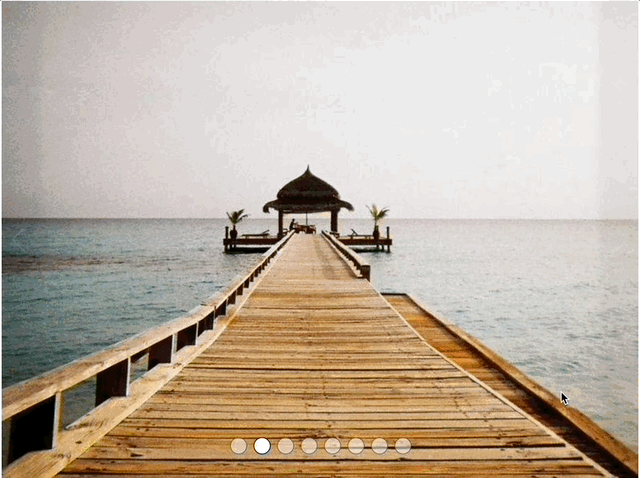
Conclusion
Now that the gallery is fully functional, there are a lot of improvements that could be made. For instance, you could preload some of the images so the first impression is always clean (<link rel="preload" href="https://picsum.photos/id/76/800/600" as="image">) but remember that will slow down the initial paint of your site.
You could also render labels with small thumbnails of the images next to the radio buttons, then hide the radio button inputs and rely on the user clicking the thumbnail/label to select the radio button.
You could move the next/prev button containers to the upper right corner. Or to the lower corners, so all the controls are right along the bottom of the carousel.
With a little effort, you could add a few classes that change the whole theme of the carousel - .controls-bottom, .vertical-controls or .thumbnail-controls so changing the user experience is as easy as adding a class. I’ll leave that up to you.
A little JS could make this an auto-play gallery by setting an interval to select the next radio button every 5 seconds and removing the manual controls.
CSS will obviously never replace JS, but I feel we should use the languages for their intended purpose. CSS should be mainly for presentation, Javascript for logic that must be handled in front of the user, such as form assistance. Though, CSS can get you a long ways with form validation, but that’s a story for another day.
You can view the Full Carousel Example Page or you can check out the CSS-only Carousel repo on Github.