CSS Form Validation

Motivation
Forms are everywhere on the web; there’s no avoiding them. And default forms are ugly. However, There’s a lot you can do with CSS to make forms prettier, more useful, more helpful, and easier to fill out. In this post we’ll push the limits a bit of what CSS can do with form inputs. And as usual, no Javascript will be used.
Accessibility
First, here’s a note on accessibility. It’s hard to find stats on how many people use screen readers or other tools to help them use the internet. But, even if it’s only a few million, making your site more accessible to them will help you stand out from other sites. A little effort actually goes a long way.
HTML provides several tags and attributes that screen readers rely on: <label> tags, aria attributes and role attributes. Here’s a breakdown:
| Element | Description |
|---|---|
| Label Tag | Adds context to a form input e.g. ‘First Name’ |
| area-label attribute | Like a label tag, but can be used on any element |
| aria-required | Indicates a field must be filled out |
| aria-describedBy | ‘Links’ other elements that describe or add context, such as an error message or hint text |
| aria-invalid | Marks a field as invalid so Assistive Tech knows why a form didn’t submit |
| role | Indicate the role of the element |
We’ll use all these in our markup, except for aria-invalid which would need to be added with JS or from a server-side render after validation. You’re doing server-side validation always, right?
Basic Form Styles
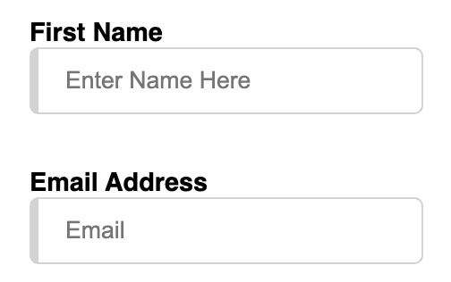
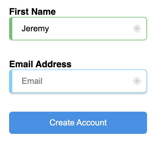
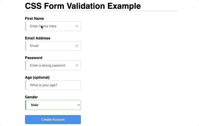
Let’s add some basic form elements to a new HTML file. We’ll use nested inputs in labels to reduce our markup (nested markup or for/id attributes are both WCAG compliant).
<body>
  <form>
    <label for="first_name">First Name
      <input type="text" id="first_name" name="first_name" placeholder="Enter Name Here" required/>
    </label>
    <label for="email_address">Email Address
      <input type="email" id="email_address" name="email_address" placeholder="Email" required/>
    </label>
    <input type="submit" value="Create Account" />
  </form>
</body>
Add some styles:
label {
  display: block;
  position: relative;
  font-size: .9em;
  font-weight: 600;

  & + label {
    margin-top: 30px;
  }

  input {
    display: block;
    box-sizing: border-box;
    min-width: 220px;
    border: 1px solid lightgrey;
    border-left: 5px solid lightgrey;
    border-radius: 5px;
    outline: none;
    padding: 10px 15px;
  }

  input[type=text]:placeholder-shown,
  input[type=email]:placeholder-shown {
    border-color: lightgrey;
  }
}
and now we have a simple form.
Focus State
Use :focus to select an element that currently has focus, meaning the user has clicked, tapped, tabbed to, or in some other way indated that they want to interact with that element. Let’s make our input border change when focused
label {
  input[type=text]:focus,
  input[type=email]:focus {
    border-color: lightskyblue;
    box-shadow: 0 2px 5px 0 rgba(0,0,0,0.1);
  }
}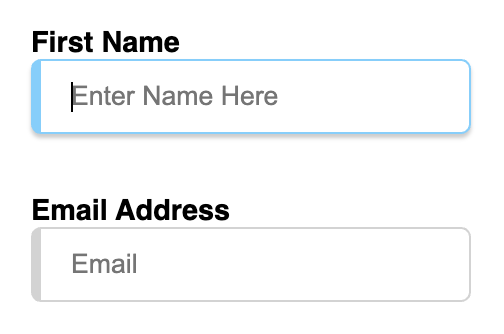
Now the user can easily tell which element they are interacting with. This is really important for users who are tabbing through the form to fill out the fields.
HTML Validation
I like HTML validation, though it gets plenty of hate (especially from designers :). It isn’t very customizable visually, but it works reliably. It has a bunch of built-in validation types and is triggered natively when the form submits. It also stays out of the way while the user is filling out the form, and only appears if the user had a problem filling out the form. If so, an error is shown and is updated in real-time as the user corrects the issue.
Next we explore a few fields with built-in validations and how to customize them.
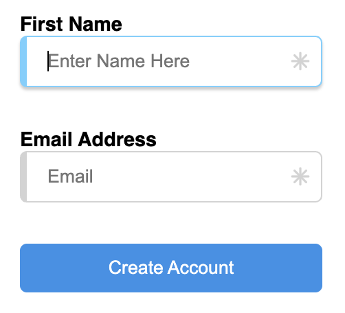
Requiredness
You may have noticed in the HTML above that we used the required attribute on the inputs. This will cause the browser to validate these fields when the form is submitted. Let’s add a submit button and indicate to the user that these fields are required.
<input type="submit" value="Create Account" />input {
display: block;
box-sizing: border-box;
min-width: 220px;
border-radius: 5px;
outline: none;
padding: 10px 15px;
}
input:not([type=submit]) {
border: 1px solid lightgrey;
border-left: 5px solid lightgrey;
}
input[type=submit] {
background: #4A90E2;
color: white;
margin-top: 30px;
border: none;
cursor: pointer;
&:hover {
background: #357ABD;
}
}
input:not([type=submit])[type=text]:placeholder-shown,
input:not([type=submit])[type=email]:placeholder-shown {
border-color: lightgrey;
}
input:not([type=submit])[type=text]:focus,
input:not([type=submit])[type=email]:focus {
border-color: lightskyblue;
box-shadow: 0 2px 2px 0 rgba(0,0,0,0.2);
}
input[required] {
background-image: url('data:image/svg+xml,<svg xmlns="http://www.w3.org/2000/svg" width="24" height="24" viewBox="0 0 24 24" fill="none" stroke="lightgrey" stroke-width="2" stroke-linecap="round" stroke-linejoin="round"><line x1="17" y1="7" x2="7" y2="17"></line><line x1="7" y1="7" x2="17" y2="17"></line><line x1="12" y1="5" x2="12" y2="19"></line><line x1="5" y1="12" x2="19" y2="12"></line></svg>');
background-repeat: no-repeat;
background-position: right 5px center;
background-size: 20px;
}
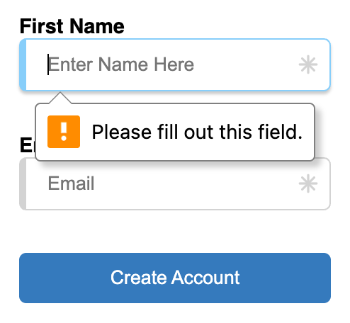
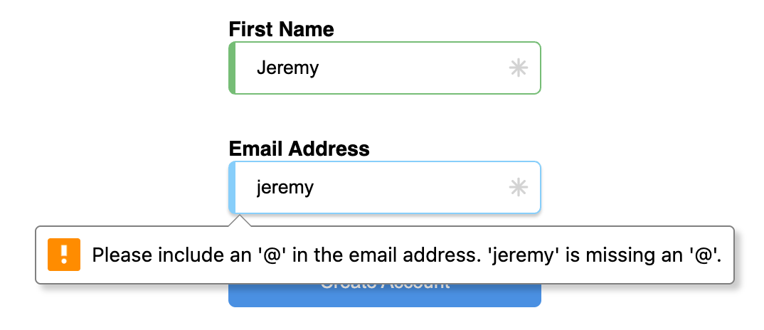
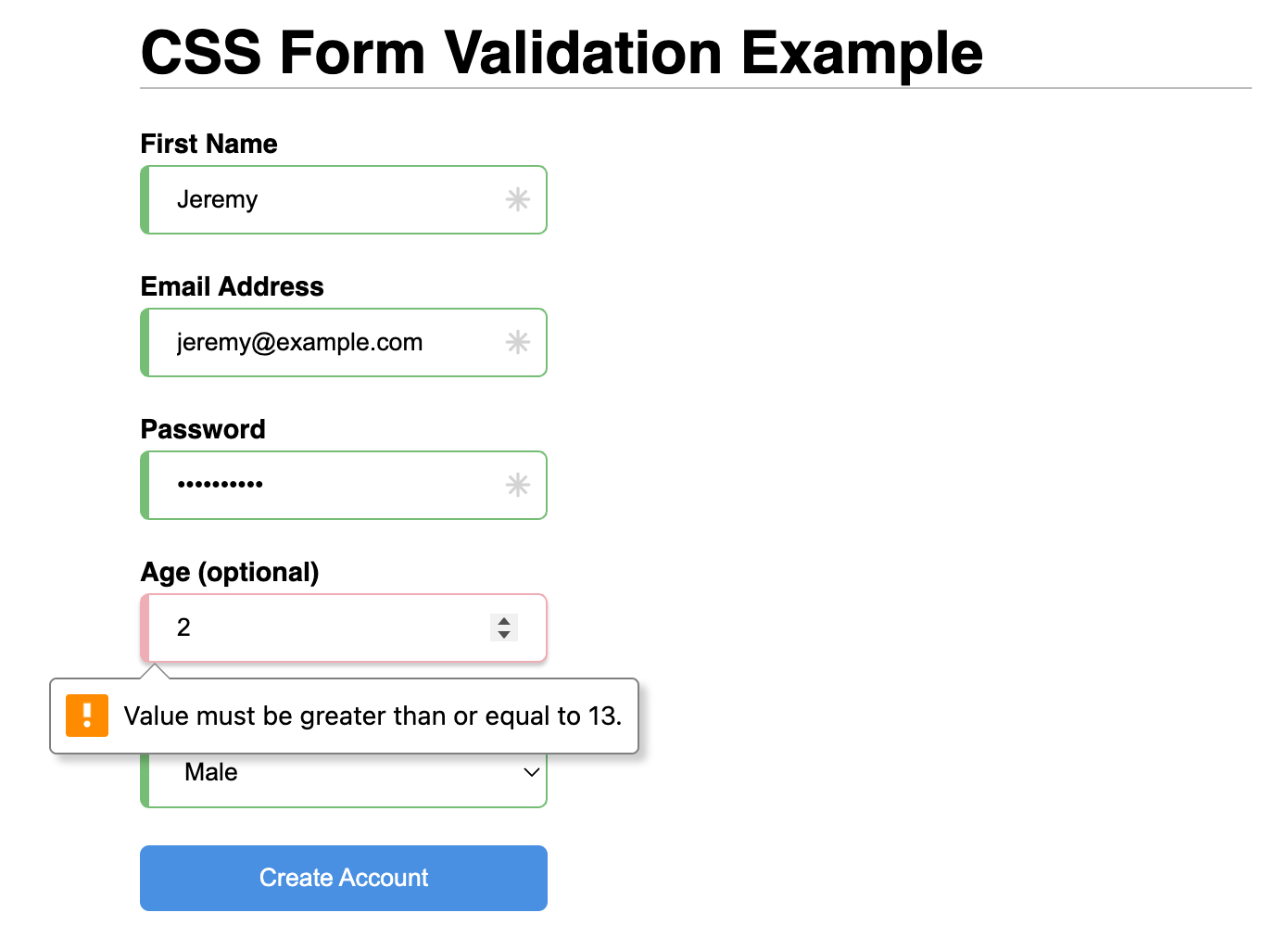
If you try to submit the form right now, the browser notices there are required fields without a value and helpfully generates a message to inform the user. In Chrome on MacOS it looks like the following image, but every browser and OS can display the errors differently. The important thing is that they all do.
We should reward the user for filling out the fields properly! The border should turn green when they have entered a valid value.
input:not([type=submit]):valid:not(:placeholder-shown) {
  border-color: rgb(118, 189, 118);
  border-left: 5px solid rgb(118, 189, 118);
}
Let’s move on to some other validation types.
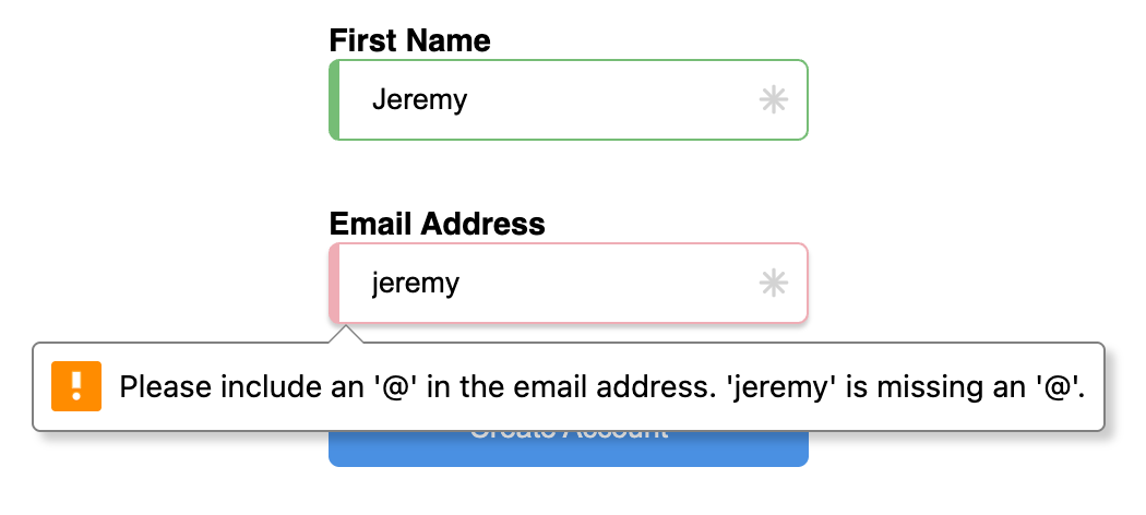
HTML5 defined a new type for input called email which comes with a validator. The HTML we used above already has type='email' so let’s see if it works.
Nice! But it looks too happy to be an error.
input:not([type=submit]):invalid:not(:placeholder-shown) {
  border-color: #EFADB5;
}
And now it looks like a proper error that needs attention.
Password
We’ve seen required validation and email field validation performed by the browser. You can also do custom validations using RegEx patterns. Let’s add a password field that is required, but also has additional content requirements.
<label for="password">Password
  <input type="text" id="password" name="password" placeholder="Enter a strong pasword" required pattern="(?=.*[a-z])(?=.*[A-Z])(?=.*\d).{8,}"/>
</label>
HTML5 validations again know what to do and show an error message when the form is submitted.
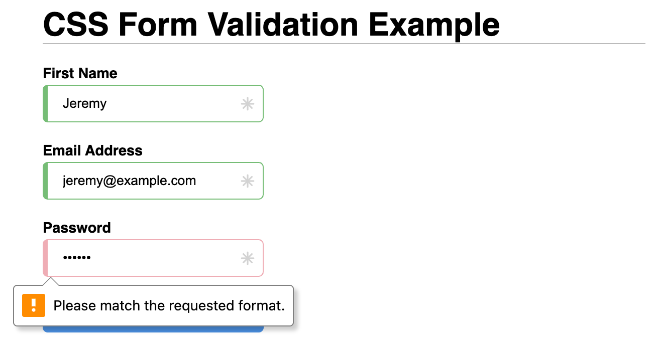
That isn’t very helpful! We’ll add hints in a minute to help the user know what is expected for each field. First let’s cover a few more field types and their styles.
Number
Number fields can have a min, a max and a step value defined.
<label for="password">Password
  <input type="text" id="password" name="password" placeholder="Enter a strong pasword" required pattern="(?=.*[a-z])(?=.*[A-Z])(?=.*\d).{8,}"/>
</label>
As you can see, validations just work automatically.
Select
Styling a select box can be tricky with CSS, as in most browsers there is always something selected in a select box - usually the first option by default. So I guess the best we can do with this CSS route is to mark them as valid.
form select {
  border-color: rgb(118, 189, 118);
  border-left: 5px solid rgb(118, 189, 118);
}
Let’s move on to hints to help the user as they’re filling out this form.
Field Hints
Let’s add hint text next to each input field in our HTML markup.
<form>
  <label for="first_name">First Name
    <input type="text" id="first_name" name="first_name" placeholder="Enter Name Here" required/>
    <span class='hint'>We'll use this to address you</span>
  </label>
  <label for="email_address">Email Address
    <input type="email" id="email_address" name="email_address" placeholder="Email" required/>
    <span class='hint'>You will use this email address to log in</span>
  </label>
  <label for="password">Password
    <input type="password" id="password" name="password" placeholder="Enter a strong pasword" required pattern="(?=.*[a-z])(?=.*[A-Z])(?=.*\d).{8,}"/>
    <span class='hint'>Passwords need 8 chars (with upper, lower and number)</span>
  </label>
  <label for="age">Age (optional)
    <input type="number" id="age" name="age" placeholder="What is your age?" min="13" max="120"/>
    <span class='hint'>You must be at least 13 years old to use this service</span>
  </label>
  <label for="gender">Gender
    <select name="gender" title="Select your gender" required>
      <option value="male">Male</option>
      <option value="female">Female</option>
    </select>
    <span class='hint'>For statistical purposes</span>
  </label>

  <input type="submit" value="Create Account" />
</form>
Now we’ll style them away until their associated field has focus. That way the UI isn’t cluttered up with a bunch of hint text.
.hint {
  display: block;
  opacity: 0;
  font-size: 0.9em;
  font-style: italic;
  color: #666;
  position: absolute;
  left: 110%;
  width: max-content;
  bottom: 10px;
  transition: opacity 0.2s ease-in-out, left 0.2s ease-in-out;
}

input:focus + .hint,
select:focus + .hint {
  opacity: 1;
  left: 105%;
}
With this, we give the user enough information to hopefully fill out the form perfectly the first time. If not, HTML validation will guide them through getting it right.
Also, always validate user input server-side! Front-end validation is never enough.
Here’s the final product
Conclusion
With CSS and a simple HTML structure, many forms will just work right out-of-the-box. For more complicated forms (like with many conditional validations) a JS library would probably be preferred.
You can view the CSS Form Validation and Styling Example Page or you can check out the CSS Form Validation and Styling repo on Github.