Lightweight CSS Tooltips

Motivation
There is a frequent need to present less visual information to a user. When only the most important information is shown, the user can likely find what they need quickly and not be distracted by having to read and parse text. It’s a good practice to be concise with text, especially on web where efficiency is valued.
However in the quest for efficient communication, we sometimes find cases where additional context or clarity is required, and the design doesn’t afford space for such text. A good solution is to use a tooltip with a clear trigger icon. A user will quickly learn that a ‘help’ icon will present additional context for content that isn’t immediately clear.
CSS-only
A tooltip is a piece of content that is shown when a user performs some action indicating they need additional context. As will all things coding, there are tradeoffs with every decision. CSS-only tooltips are crazy fast, require no libraries or packages, have smooth animations, and can hold any content (as we’ll see in another blog post). If you have a lot of content in a tooltip (or have large images in them), you can use translate3d to position it, allowing the browser to offload the processing to the GPU for better performance.
On the other hand, CSS doesn’t have as much dynamic context-awareness as Javascript. We don’t always know if a tooltip is too close to the edge of the viewport using only CSS.
What we’ll be building today is a simple, styled text container that appears when the user hovers/touches an icon. The tooltip content and settings will be in data attributes to make it easy to add them. It will rely on the developer to use media queries or container queries to make sure the tooltip doesn’t overflow out of the viewport.
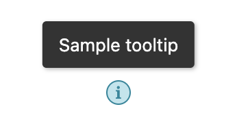
Help icon
Let’s give the user a consistant visual indicator for tooltips. If they feel stuck or confused they can rely on the nearest icon.
A nice svg or small image would work great for this, but we’ll just use a styled span for simplicity.
Also, we’ll use CSS variables to make this easy to change when a design update comes along.
<span class="help-icon"></span>And some base styles:
:root {
  --tooltip-help-icon-font-size: 12px;
  --tooltip-help-icon-border: 1px solid #3a859a;
  --tooltip-icon-border-radius: 500px;
  --tooltip-help-icon-size: 16px;
  --tooltip-help-icon-color: #3a859a;
  --tooltip-help-icon-background-color: #c4e4ec;
}
.help-icon {
  font-size: var(--tooltip-help-icon-font-size);
  border: var(--tooltip-help-icon-border);
  border-radius: var(--tooltip-icon-border-radius);
  display: flex;
  align-items: center;
  justify-content: center;
  width: var(--tooltip-help-icon-size);
  height: var(--tooltip-help-icon-size);
  color: var(--tooltip-help-icon-color);
  background-color: var(--tooltip-help-icon-background-color);
}
Well, it’s nothing to write home about:
Data Attribute Interface
To control the content and the position, we’ll use data attributes. HTML allows attribute not specifically part of the spec to be added a DOM element, and has assigned any that start with data- as custom attributes for use by web developers.
Here we’ll use two to control where the tooltip appears, and what text should be displayed.
<span class="help-icon" data-tooltip-text="Sample tooltip" data-tooltip-position="n"></span>We’ll then use CSS to access the content and display it next to the icon, and we’ll use the position to determine on which side to place it, as well as which direction the indicator arrow should point.
The Tooltip
The tooltip itself will be a couple pseudo-elements (before and after) of the trigger element. The before element we’ll use to contain and style the text content near the trigger. We’ll use the after element to indicate which tooltip is currently being shown. This will usually be obvious to the user as they just tapped the icon, but sometimes it could be confusing (for instance if there are a bunch of bars in a bar graph and there is a tooltip indicating the amount on a particular day - it might overlap several bars.)
Here’s some base styles to get things set up:
:root {
  /* Tooltip dimensions */
  --tooltip-width: 200px;
  --tooltip-padding: 8px 12px;
  --tooltip-arrow-height: 5px;
  --tooltip-distance-from-trigger: 5px;
  --tooltip-border-radius: 3px;

  /* Tooltip colors */
  --tooltip-background-color: #333;
  --tooltip-color: #fff;
}
[data-tooltip-text] {
  position: relative;
}

[data-tooltip-text]:before,
[data-tooltip-text]:after {
  opacity: 0;
  z-index: 100;
  pointer-events: none;
}

[data-tooltip-text]:hover:before,
[data-tooltip-text]:hover:after {
  opacity: 1;
  pointer-events: all;
}
Let’s see how those variables are used in the content and arrow pseudoelements.
Content Pseudoelement
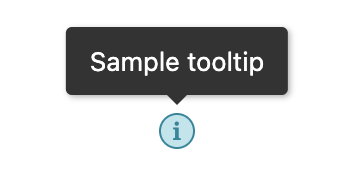
The before element contains the tooltip content. We use the attr() value to get the content from the custom data-tooltip-text attribute. These styles put the content directly above the tooltip trigger. So the default position is “North”.
[data-tooltip-text]:before {
  content: attr(data-tooltip-text);
  font-family: system-ui, sans-serif;
  position: absolute;
  width: var(--tooltip-width);
  padding: var(--tooltip-padding);
  line-height: 18px;
  text-align: left;
  font-size: 13px;
  font-weight: normal;
  white-space: normal;
  box-shadow: 1px 1px 3px rgba(0, 0, 0, 0.3);
  border-radius: var(--tooltip-border-radius);
  background-color: var(--tooltip-background-color);
  color: var(--tooltip-color);
  top: calc(-1 * (var(--tooltip-distance-from-trigger) + var(--tooltip-arrow-height)));
  bottom: auto;
  left: 50%;
  right: auto;
  transform: translate3d(-50%, -100%, 0);
}
Here’s what the tooltip looks like
Arrow Pseudoelement
The `after element is the small triangle/arrow that is positioned near the tooltip trigger to connect the trigger to the content.
[data-tooltip-text]:after {
  content: '';
  color: var(--tooltip-background-color);
  display: block;
  position: absolute;
  height: 0;
  width: 0;
  transform: translate3d(-50%, 0, 0);
  border-top: var(--tooltip-arrow-height) solid var(--tooltip-background-color);
  border-left: var(--tooltip-arrow-height) solid transparent;
  border-right: var(--tooltip-arrow-height) solid transparent;
  border-bottom: none;
  top: calc(-1 * (var(--tooltip-distance-from-trigger) + var(--tooltip-arrow-height)));
  bottom: auto;
  left: 50%;
  right: auto;
}
Again, this is defaulting to the north position, so we’re using a CSS border trick to make a triangle on the bottom right between the text before and the trigger element. Here we have a styled tooltip.
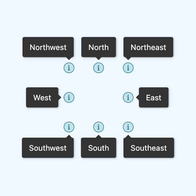
Directions
Let’s make it work on any side, starting with the right/east side. We just need to override a few properties to get it moved.
[data-tooltip-position='e']:before {
  top: 50%;
  bottom: auto;
  right: calc(-1 * (var(--tooltip-distance-from-trigger) + var(--tooltip-arrow-height)));
  left: auto;
  transform: translate3d(100%, -50%, 0);
}

[data-tooltip-position='e']:after {
  transform: translate3d(100%, -50%, 0);
  border-top: var(--tooltip-arrow-height) solid transparent;
  border-bottom: var(--tooltip-arrow-height) solid transparent;
  border-right: var(--tooltip-arrow-height) solid var(--tooltip-background-color);
  border-left: none;
  top: 50%;
  bottom: auto;
  right: -5px;
  left: auto;
}
The other directions follow the same pattern. Refer to the Lightweight CSS Tooltips repo where you can see code for all 8 cardinal and ordinal directions.
Animation Delay
Often, it’s annoying to have tooltips appear when you’re mousing across the screen - you never know when something will appear under your cursor! To fix this, we can add a short delay between when the hover state is started and when the tooltip appears.
:root {
  --tooltip-fade-out-duration: 500ms;
  --tooltip-fade-in-duration: 500ms;
}
[data-tooltip-text]:before,
[data-tooltip-text]:after {
  opacity: 0;
  z-index: 100;
  transition: opacity var(--tooltip-fade-out-duration), visibility 0ms linear var(--tooltip-fade-out-duration);
  pointer-events: none;
}

[data-tooltip-text]:hover:before,
[data-tooltip-text]:hover:after {
  opacity: 1;
  pointer-events: all;
  transition-delay: var(--tooltip-fade-in-duration);
}
Now when a user hovers a tooltip, it will wait half a second before showing the tooltip. That should be long enough to be fairly sure the user wants to see the tooltip, but not too long for the user to get tired of waiting for it to appear
Here’s the final with the delay:
Conclusion
If you’re looking for quick tooltips to help clarify content, this is about as easy as it gets: data-tooltip-text="Account Settings".
Again, this isn’t viewport aware, so these could render off the page. You’ll need to place them with data-tooltip-position to a safe screen location. If you need to use media queries or container queries, you could make some classes like tooltip-position-sm-n that overrides the position to be North on small screens, no matter what it was set to in the original attribute.
You can view the Lightweight CSS Tooltips Example Page or you can check out the Lightweight CSS Tooltips repo on Github.