Animated Lighting
Background
A few years ago, Microsoft released a new emoji set called Fluent Emoji. It includes all the usual glyphs we commonly use such as emotion faces, animals, nature, food, and so on. They have several visual options for each glyph in the set: 3D, flat, or black and white (high contrast).
For this post, we’ll be making an animated scene using art from this icon set. We’ll explore basic movement powered by CSS and use CSS filters to adjust the lighting dynamically with brightness() and contrast().
Maybe useful as a hero banner for an app website or something like that. Or maybe not useful at all, and it’s just fun :)
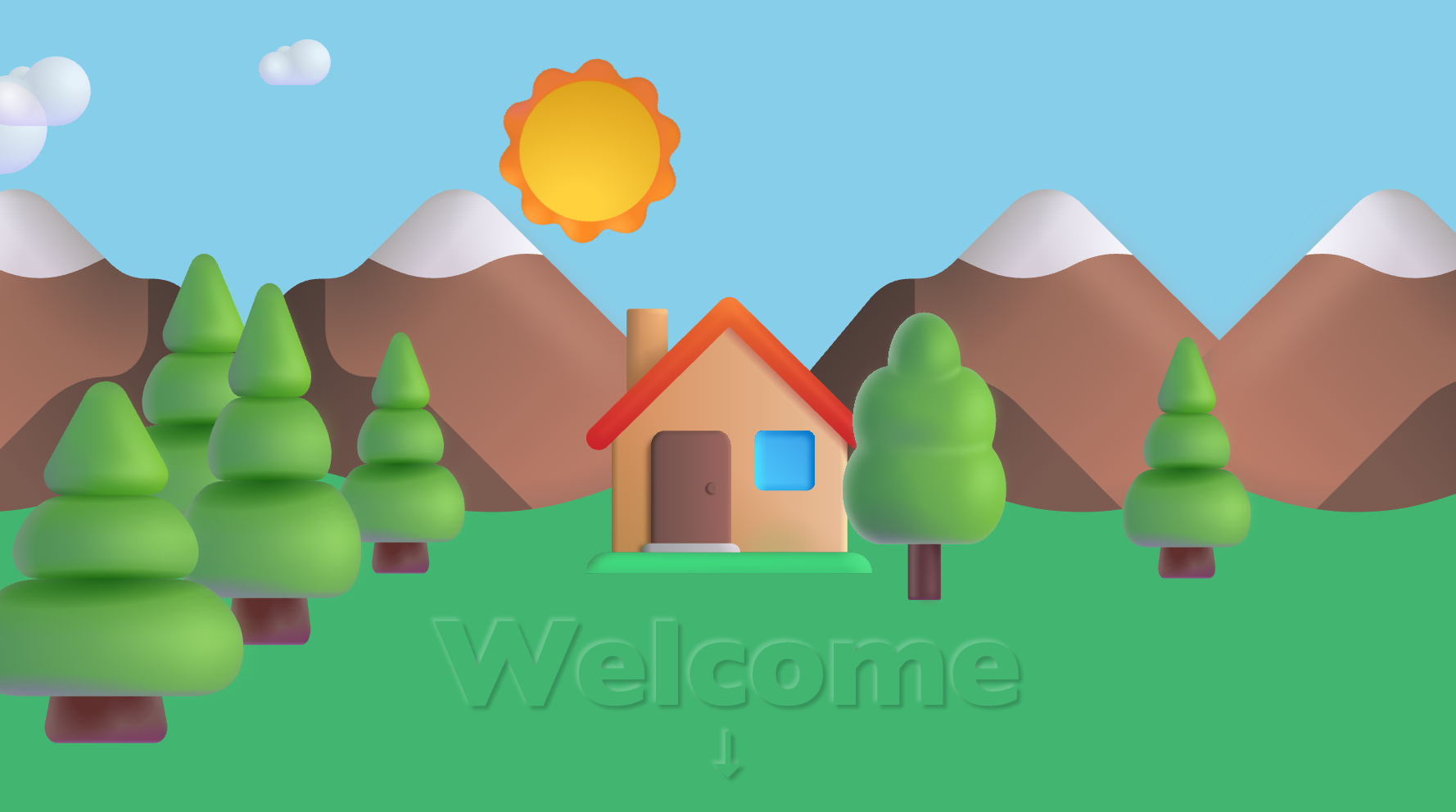
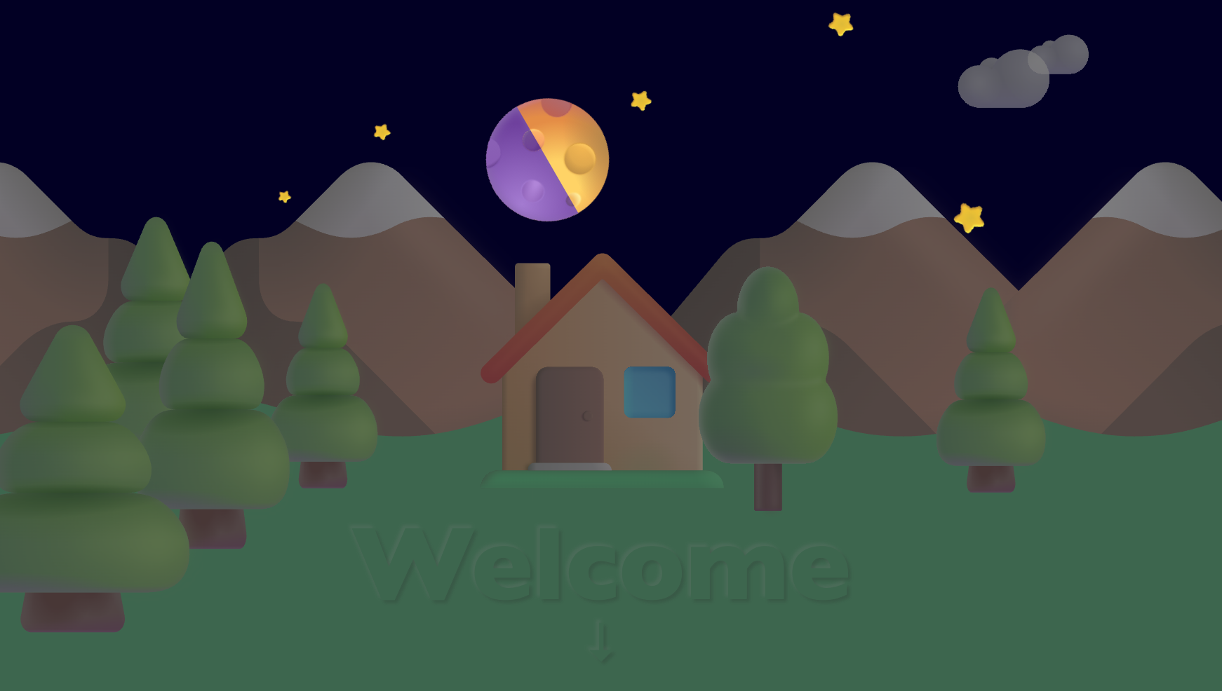
Here’s a screenshot of what we’ll be making - a peaceful cabin in the woods with an animated sky:
The Sky
The sky will be a single div that we’ll rotate around it’s center. One half will contain a sun, and the other half will contain a moon and stars.
Here’s the HTML
<body>
  <div id="hero">
    <div id="sky">
      <div id="stars">
        <img src="star.svg">
        <img src="star.svg">
        <img src="star.svg">
        <img src="star.svg">
        <img src="star.svg">
        <img src="star.svg">
        <img src="star.svg">
        <img src="star.svg">
        <img src="star.svg">
        <img src="star.svg">
        <img src="star.svg">
        <img src="star.svg">
        <img src="star.svg">
      </div>

      <div id="moon">
        <img src="moon_new.svg">
        <img src="moon_waxing_crescent.svg">
        <img src="moon_first_quarter.svg">
        <img src="moon_waxing_gibbous.svg">
        <img src="moon_full.svg">
        <img src="moon_waning_gibbous.svg">
        <img src="moon_last_quarter.svg">
        <img src="moon_waning_crescent.svg">
      </div>
      <div id="sun">
        <img src="sun.svg">
      </div>
    </div>
  </div>
</body>
Feel free to add more or less stars, or optimize by using a single embedded SVG and use <use xlink:href="#star-group"> to reuse the star path in other svgs.
To get the sky to change color, we add some basic CSS animations to the #hero element:
#hero {
display: flex;
--day-duration: 60s;
--moon-duration: 480s;
--cycle-offset: -25s;
background: #020024;
overflow: hidden;
width: 100vw;
height: 100vh;
animation: sky var(--day-duration) linear infinite;
animation-delay: calc(var(--day-duration) * .05 + var(--cycle-offset));
position: relative;
}
@keyframes sky {
0% {
background: #020024;
}
45% {
background: #020024;
}
50% {
background: #ee689b;
}
55% {
background: skyblue;
}
85% {
background: skyblue;
}
90% {
background: orange;
}
95% {
background: #020024;
}
100% {
background: #020024;
}
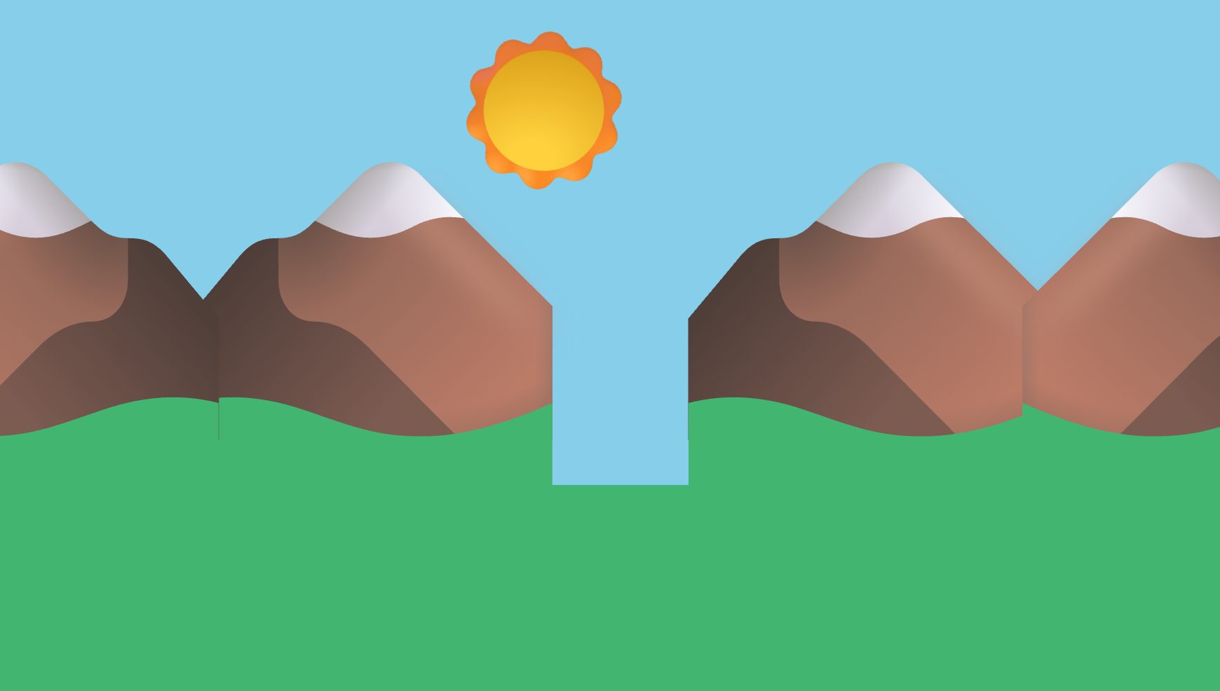
}Here’s the sky layer during sunrise:

Celestial Bodies
What’s a sky without the sun, moon and stars? Boring. Fixing that next.
Sun and Stars
Let’s add some styles to the sun and stars.
#sun {
  width: 100px;
  height: 100px;
  position: absolute;
  left: 80%;
  top: 45%;
  animation: rotate var(--day-duration) linear infinite;
  transform-origin: center center;
  animation-direction: reverse;
}
#sun img {
  transform: scale(400%);
}
#sky img {
  position: absolute;
}
#stars {
  width: 100%;
  height: 100%;
  animation: stars var(--day-duration) linear infinite;
  animation-delay: calc(var(--day-duration) / -2 + var(--cycle-offset));
}
#stars img:nth-child(1) {
  transform: rotate(30deg) scale(50%);
  top: 5%;
  left: 50%;
}
#stars img:nth-child(2) {
  transform: rotate(35deg) scale(75%);
  top: 10%;
  left: 30%;
}
#stars img:nth-child(3) {
  transform: rotate(30deg) scale(60%);
  top: 20%;
  left: 10%;
}

[... and so on ...]

#stars img:nth-child(13) {
  transform: rotate(61deg) scale(60%);
  top: 70%;
  left: 50%;
}
If you are using a CSS preprocessor, you could put those star definitions in an array and loop through to generate the CSS. That might make it easier to manage.
Moon
For the moon, I wanted there to be moon phases, since there are emoji glyphs for all the phases.
With the following styles, we use animation-delay to set the timings of the different phases so they transition while the moon is ‘down’.
#moon {
  position: absolute;
  left: 15%;
  top: 45%;
  transform: scale(400%);
  animation: rotate var(--day-duration) linear infinite;
  transform-origin: center center;
  animation-direction: reverse;
  width: 100px;
  height: 100px;
}
#moon img {
  position: absolute;
  left: 0;
  top: 0;
  width: 100%;
  height: 100%;
}
#moon img {
  animation: moon infinite;
  animation-duration: var(--moon-duration);
  animation-timing-function: linear;
  animation-fill-mode: backwards;
}
#moon img:nth-child(1) {
  animation-delay: 0s;
}
#moon img:nth-child(2) {
  animation-delay: calc(var(--moon-duration) / (-8/1) + var(--cycle-offset));
}
#moon img:nth-child(3) {
  animation-delay: calc(var(--moon-duration) / (-8/2) + var(--cycle-offset));
}
#moon img:nth-child(4) {
  animation-delay: calc(var(--moon-duration) / (-8/3) + var(--cycle-offset));
}
#moon img:nth-child(5) {
  animation-delay: calc(var(--moon-duration) / (-8/4) + var(--cycle-offset));
}
#moon img:nth-child(6) {
  animation-delay: calc(var(--moon-duration) / (-8/5) + var(--cycle-offset));
}
#moon img:nth-child(7) {
  animation-delay: calc(var(--moon-duration) / (-8/6) + var(--cycle-offset));
}
#moon img:nth-child(8) {
  animation-delay: calc(var(--moon-duration) / (-8/7) + var(--cycle-offset));
}
And the related animations:
@keyframes stars {
0% {
opacity: 0;
}
45% {
opacity: 0;
}
55% {
opacity: 1;
}
95% {
opacity: 1;
}
100% {
opacity: 0;
}
}
@keyframes moon {
0% {
opacity: 0;
}
87% {
opacity: 0
}
87.5% {
opacity: 1;
}
}
@keyframes rotate {
0% {
transform: rotate(0deg);
}
100% {
transform: rotate(360deg);
}
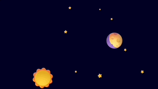
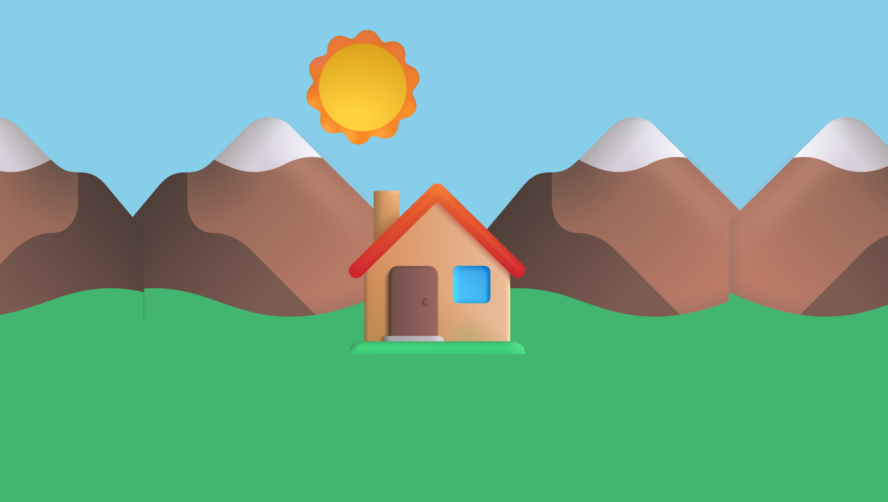
}With the celestial bodies hung in place and animations added, we now have a nice solar system from the view of a planet, but no planet! Here’s what we have so far:
Terrain
Now the markup for the terrain and flora. This markup is adjacent to the sky element.
<div id="ground">
  <div id="mountain">
    <img src="mountain.svg">
    <img src="mountain.svg">
    <img src="mountain.svg">
    <img src="mountain.svg">
  </div>
  <div id="house"></div>
  <div id="trees">
    <img src="pinetree.svg">
    <img src="pinetree.svg">
    <img src="pinetree.svg">
    <img src="pinetree.svg">
    <img src="tree.svg">
    <img src="pinetree.svg">
  </div>
</div>
<div id="clouds">
  <img src="cloud.svg">
  <img src="cloud.svg">
  <img src="cloud.svg">
</div>
You may have noticed we have a ground element in our HTML. The styles for that just place it at a convenient height to cover up the bottom part of the animation.
#ground {
  position: absolute;
  left: 0;
  top: 70vh;
  width: 100vw;
  height: 30vh;
  background: #42B671;
  animation: daynight var(--day-duration) linear infinite;
  animation-delay: calc(var(--day-duration) * -.95 + var(--cycle-offset));
}
Adding a few styles to the mountains makes the horizon more believable and helps sell the effect of the sun rising and setting.
#mountain img:nth-child(1) {
  position: absolute;
  left: 50%;
  bottom: 80%;
  width: 60vmin;
  height: 60vmin;
  transform: translateX(-110%);
}

#mountain img:nth-child(2) {
  position: absolute;
  left: 50%;
  bottom: 80%;
  width: 60vmin;
  height: 60vmin;
  transform: translateX(-190%) scaleX(-1);
}
#mountain img:nth-child(3) {
  position: absolute;
  left: 50%;
  bottom: 80%;
  width: 60vmin;
  height: 60vmin;
  transform: translateX(10%);
}
#mountain img:nth-child(4) {
  position: absolute;
  left: 50%;
  bottom: 80%;
  width: 60vmin;
  height: 60vmin;
  transform: translateX(90%) scaleX(-1);
}
Better, but what’s up with the box canyon, and the seams on the peaks? Let’s just cover them up with a house and some trees.
House
This is positioned just right to cover the imperfections in the mountain seams
#house {
  background-image: url("house.svg");
  background-size: contain;
  background-repeat: no-repeat;
  background-position: center;
  position: absolute;
  left: 50%;
  bottom: 90%;
  width: 40vmin;
  height: 40vmin;
  transform: translateX(-50%);
}
Trees
There are quite a few trees in the Fluent Emoji set, but since this house is in the mountains, let’s put some pine trees around it. And maybe a deciduous next to the cabin where the occupants can care for it and keep the deer from eating it.
#trees img {
  position: absolute;
  left: 50%;
}
#trees img:nth-child(1) {
  bottom: 110%;
  width: 40vmin;
  height: 40vmin;
  transform: translateX(-210%) scaleY(1.3);
}
#trees img:nth-child(2) {
  bottom: 90%;
  width: 40vmin;
  height: 40vmin;
  transform: translateX(-150%) scale(.7, 1);
}
#trees img:nth-child(3) {
  bottom: 90%;
  width: 40vmin;
  height: 40vmin;
  transform: translateX(-190%) scaleY(1.5);
}
#trees img:nth-child(4) {
  bottom: 50%;
  width: 40vmin;
  height: 40vmin;
  transform: translateX(-240%) scale(1.5);
}

#trees img:nth-child(5) {
  bottom: 80%;
  width: 40vmin;
  height: 40vmin;
  transform: translateX(10%) scale(.7, 1);
}

#trees img:nth-child(6) {
  bottom: 88%;
  width: 40vmin;
  height: 40vmin;
  transform: translateX(90%) scale(.7, 1);
}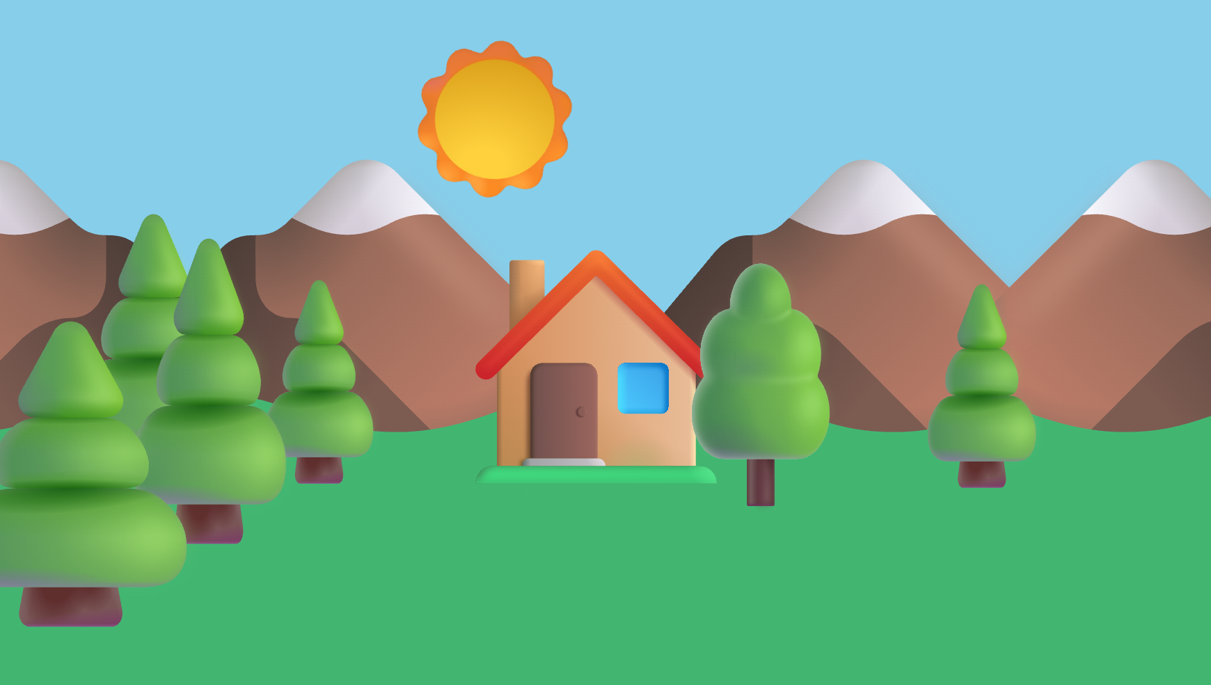
Clouds
To make the sky a bit more interesting, these styles make a few clouds drift along, slight transparent, day and night.
#clouds {
position: absolute;
left: 0;
top: 0;
width: 100vw;
height: 30vh;
animation: daynight var(--day-duration) linear infinite;
animation-delay: calc(var(--day-duration) * -.95 + var(--cycle-offset));
}
#clouds img {
width: 30vmin;
height: 10vmin;
opacity: .8;
}
#clouds img:nth-child(1) {
position: absolute;
top: 3vh;
left: -30vmin;
animation: cloud 60s linear infinite;
}
#clouds img:nth-child(2) {
position: absolute;
top: 6vh;
left: -30vmin;
height: 20vmin;
animation: cloud 80s linear infinite;
animation-delay: -30s
}
#clouds img:nth-child(3) {
position: absolute;
top: 4vh;
left: -30vmin;
height: 15vmin;
animation: cloud 50s linear infinite;
animation-delay: -40s
}
@keyframes cloud {
0% {
left: -30vmin;
}
100% {
left: 100%;
}
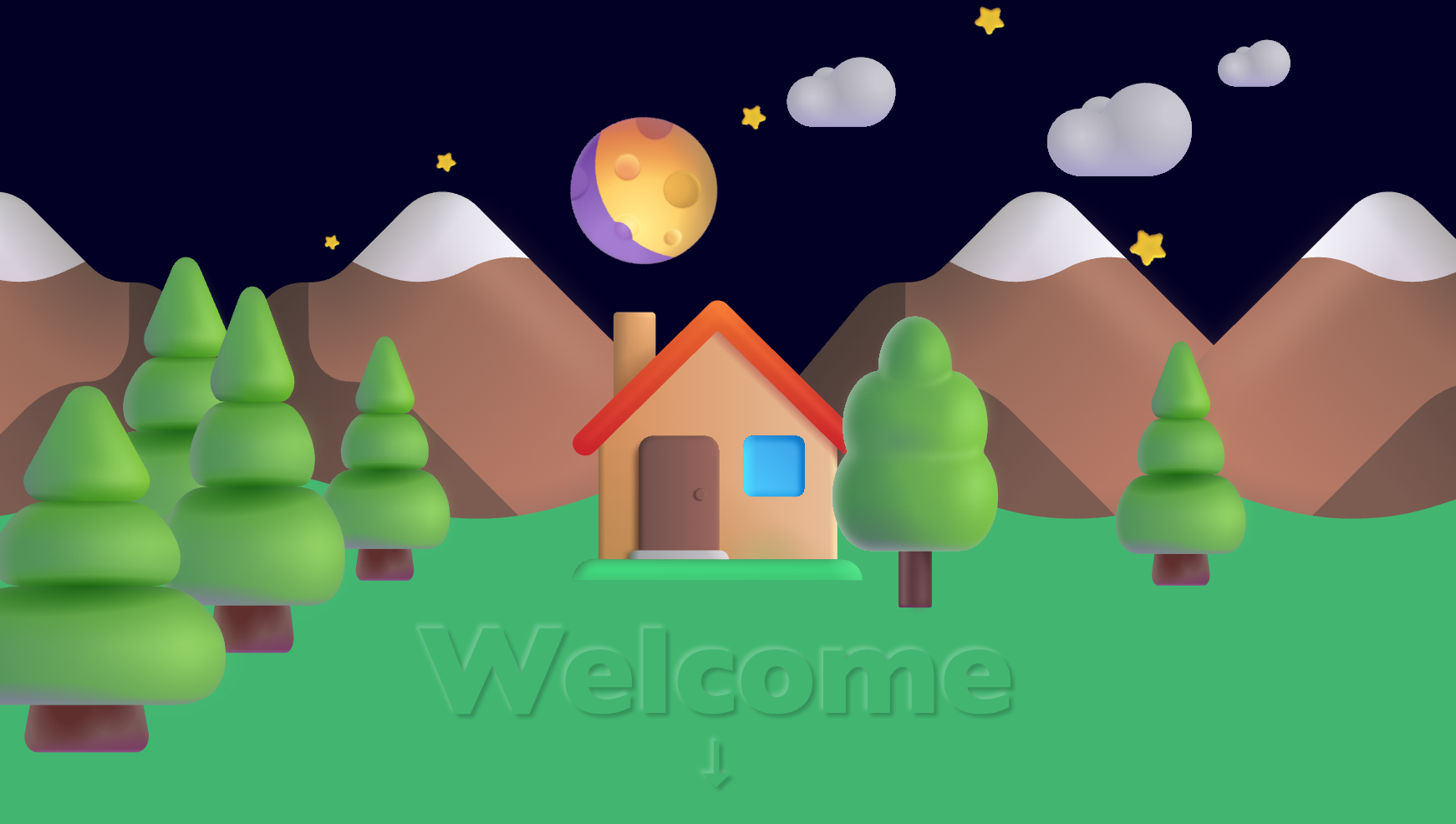
}Call To Action
To make the animation useful, let’s add some text and an indicator so the visitor knows what to do (other than meditate as they watch the animation). Add an h1 with some text right after [id=clouds]
<h1>Welcome</h1>h1 {
position: absolute;
font-size: 15vmin;
bottom: 0;
left: 50%;
transform: translateX(-50%);
color: #42B671;
text-shadow: 2px 2px 2px rgba(0,0,0,.2), -2px -2px 2px rgba(255,255,255,.2);
animation: daynight var(--day-duration) linear infinite;
animation-delay: calc(var(--day-duration) * -.95 + var(--cycle-offset));
font-family: 'Gill Sans', 'Gill Sans MT', Calibri, 'Trebuchet MS', sans-serif;
}
h1:after {
content: "\2193";
position: absolute;
left: 50%;
transform: translateX(-50%);
bottom: -7vmin;
font-size: 7vmin;
}Lighting and Contrast
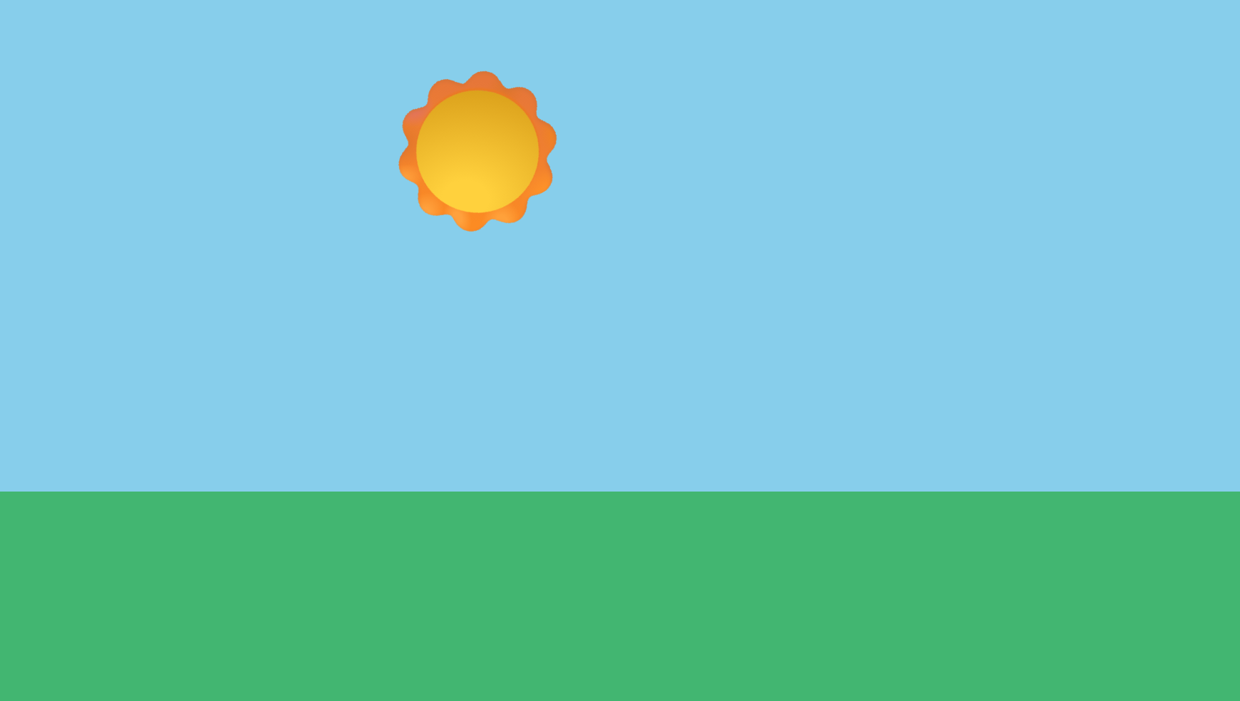
If you’re following along, you may have noticed a daynight animation attribute on most of the elements. Without it, the scene stays brightly lit, even though day and night should illuminate the scene differently. Here’s what it looks like at night without this animation:
By matching the timing of the day cycle, we can adjust the brightness and the contrast of the images to match the perceived scene lighting.
@keyframes daynight {
  0% {
    filter: brightness(0.5) contrast(0.7);
  }
  45% {
    filter: brightness(0.5) contrast(0.7);
  }
  55% {
    filter: brightness(1) contrast(1);
  }
  85% {
    filter: brightness(1) contrast(1);
  }
  95% {
    filter: brightness(0.5) contrast(0.7);
  }
  100% {
    filter: brightness(0.5) contrast(0.7);
  }
}
Conclusion
CSS is useful for so much more than just styling normal webpages. For some animations and effects, embedded videos or gifs may be the best solution. However, it would be hard to get a responsive animation similar to this with by other means for less bandwidth - the total payload for this hero banner is only 2.7k.
As front-end developers rely more and more on Javascript, CSS is continually adding features that replace what used to be only possible with JS. Animations, form validation and basic visual states can be handled without any JS payload or parsing - making page loads faster and the page more responsive.
By no means do I think CSS will (or should) try to replace JS, but I’ve found it helpful to examine the ever improving CSS toolbox and to make use of the new tools. It eliminates some of the more mundane bits of Javascript and lets my JS focus on business logic, not presentation.
You can view the Full Animation Example Page or you can check out the Animated Lighting repo on Github.