Lighthouse Layout Shift and Fonts

Motivation
I recently completed a landing page optimization contract in which the site owner was having a hard time getting a good quick-loading experience on mobile. I ran some initial tests with Chrome and noticed the Lighthouse score was in the 20s, and sometimes couldn’t even complete the test! (Lighthouse is a tool in Google Chrome for viewing UX metrics about a website - accessible in Developer Tools). A big culprit was Cumulative Layout Shift.
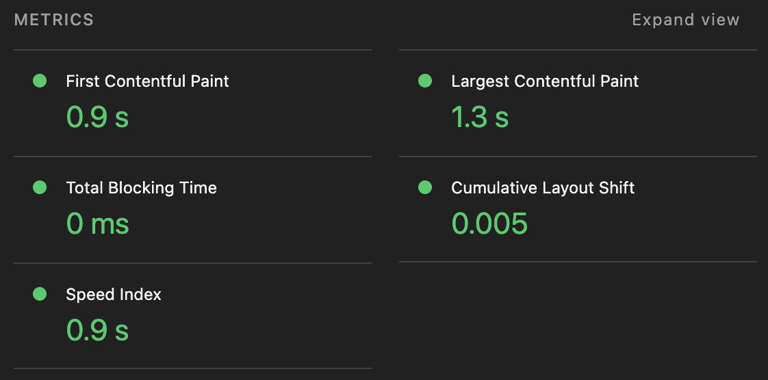
Having a Lighthouse score of 100 (or close to it) is a good indicator that your site will perform well on desktop and mobile devices. A 100 doesn’t mean your site is perfectly optimized, but it’s a good place to start and uses free tools with reasonably good feedback.
One of the trickiest parts of a good Lighthouse score is the Largest Contentful Paint (LCP) which I’ll cover in another post. The next most difficult thing that usually causes a lower score is Cumulative Layout Shift.
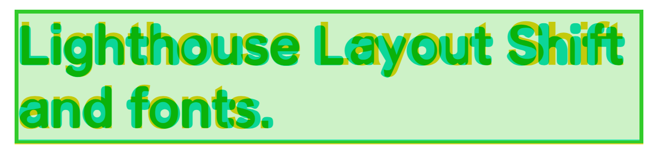
Cumulative Layout Shift is the amount the content moves around as the site resources are downloaded and rendered in the page. For instance, if you don’t specify the aspect ratio of an image, the browser will not know how much space to reserve for it when it renders the text. Then in half a second (or two or five) when the image is downloaded, the browser then inserts the image, shifting the position of the other content. This gives the impression of a slow-loading page that keeps jumping around as the user is trying to read!
It’s fairly simple to fix the shift caused by images - adding a width and height attribute on your images with the original’s width and height will allow the browser to calculate the aspect ratio and leave proper space for the image. Add a reasonable background color or gradient to the image and the user will love the experience!
But Fonts are trickier and that’s what we’re going to go over today.
Custom Font Issues
In the old days of the web, we had to rely on system fonts. We’d specify a collection of fonts that hopefully were available on the visitor’s machine, and throw in a serif or a sans-serif at the end and cross our fingers. For things that had to use a specific font, we’d use an image. Obviously this has many drawbacks, so lots of service came about to help with web fonts (Cufon, Typekit, etc).
Now we can still specify which system fonts we want to use, but also use @font-face to tell the browser where to get custom fonts that the user may not have installed! It’s a beautiful age we live in. But even our beautiful world has latency, and since we’re not relying on system fonts anymore, our content is the same boat as images now.
Just like with the images, the browser needs to know how much space to reserve for the content. We shouldn’t expect the user to wait around for all the images and fonts to be downloaded before they can read our content. That could be several seconds, or maybe forever if there’s an error getting a font or image somewhere along the pipeline.
The solution is do the same for fonts as we do with images - give a reasonable placeholder (like a backgroung color or a gradient) then swap out the placeholder for the original when the resource is downloaded.
But font’s aren’t just a 2D area, they’re much more complicated.
Modern Font Stacks
Depending on your site (and how lucky you are), a modern font stack may be all you need. You can reference Modern Font Stacks which provides excellent base sets of fonts you can specify in your CSS - no @font-face needed!
But if you need something other than the fonts listed on that page, continue reading to learn all about the anatomy of web fonts.
Anatomy of Web Fonts

There’s a lot that goes in to a font, but for this post we’ll only need to focus on a few attributes that we can adjust with CSS.
- Ascenders (#5 in diagram)
- Descenders (parts of text that extend into #20 in diagram)
- Line Gap (the overall height from top to bottom)
- Letter Spacing (the distance between glyphs)
- Font Size (the size of the font)
Defining a Fallback
You can define a good fallback font by hand if you understand all these settings for your particular font. For a more visual process, I use a tool like Fallback Font Generator. This tool allows you to select a base fallback font from a list of safe fonts, then tweak these CSS values until it is pretty close to the target custom font.
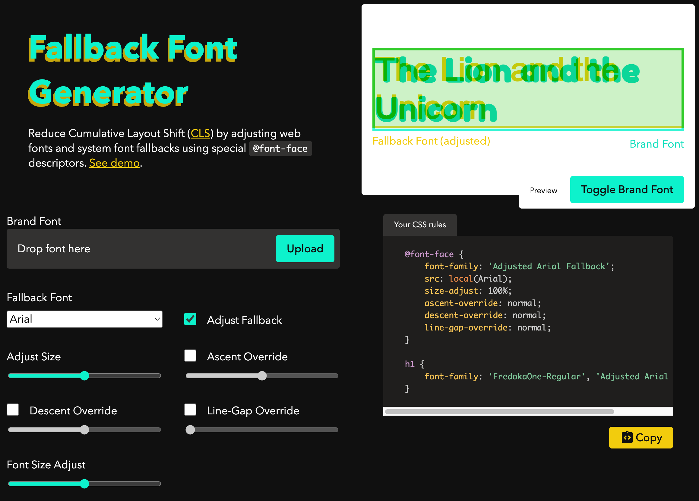
Start by uploading your target font. You can download any font from Google Fonts or use a font file provided by your designer. In the preview area, this target font will show up as green. You can toggle the target font by using the “Toggle Brand Font” button.
Now the goal is to make the yellow font match as closely as possible to the green font by adjusting the sliders below. The text in the preview area is content-editable so you can enter your actual target text if you’d like.
Begin your adjustments by selecting a font that resembles your target. Then adjust the size until the green and yellow characters are roughly the same size (even though they’re likely offset from eachother). It works best if you can get the width of the target and the fallback texts to mostly match at this point.
Check the Ascent Override box and the Line-Gap Override box. Adjust those two sliders until the vertical position of the two fonts match. Pay particular attention to line up the baseline of the fonts (#4 in the diagram). Try to add enough text to line-wrap so you can make sure you have the line settings correct.
If things aren’t lining up correctly with the letters, you can adjust letter-spacing using a DOM inspector. Try to use a unit that is based off the size of the text such as em so that it works with any size of font.
If you’ve adjusted everything correctly, you should be able to copy the code for your font fallback and try it in your site!
@font-face {
    font-family: 'Adjusted Arial Fallback';
    src: local(Arial);
    size-adjust: 110%;
    ascent-override: 86%;
    descent-override: 21%;
    line-gap-override: 3%;
}

h1 {
    font-family: 'FredokaOne-Regular', 'Adjusted Arial Fallback';
}
When a browser needs to render an h1 this code will send out a request for this unknown FredekaOne-Regular font, but then immediately render with the ‘Arial’ fallback font we defined. Since it’s geometrically similar, minimal layout shift will occur when the actual font is applied to the text.
Booyah.
Preloading
If you can’t find a font that matches close enough, you may want to resort to preloading the custom font. This will likely increase the Largest Contentful Paint time, but it will also reduce the layout shift. You also won’t flash any unstyled text to the user using this method. If your site has to look perfect always, and your visitors are willing to wait a few extra seconds, this might be the right path.
<link rel="preload" href="/assets/FredokaOne-Regular.woff2" as="font" type="font/woff2" crossorigin>Conclusion
Having good font fallbacks can make your site feel like it loads really fast and helps you get closer to that 100 Lighthouse score. You can do it!