Fun with Claymorphism

The Inspiration
My family and I love watching Shaun the Sheep - a delightful stop-motion series animated by Aardman Studios. With loveable plasticine characters, Aardman tells humorous stories highlighting the antics of farmyard animals. Something about the matte materials and flat lighting (and wordless humor!) speaks to my inner creativity. Enough so, that I wanted to try making a web UI that had the same feel.
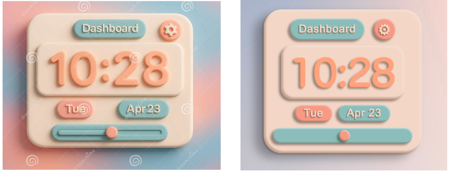
In searching for inspiration, I found the following image on Dreamstime:
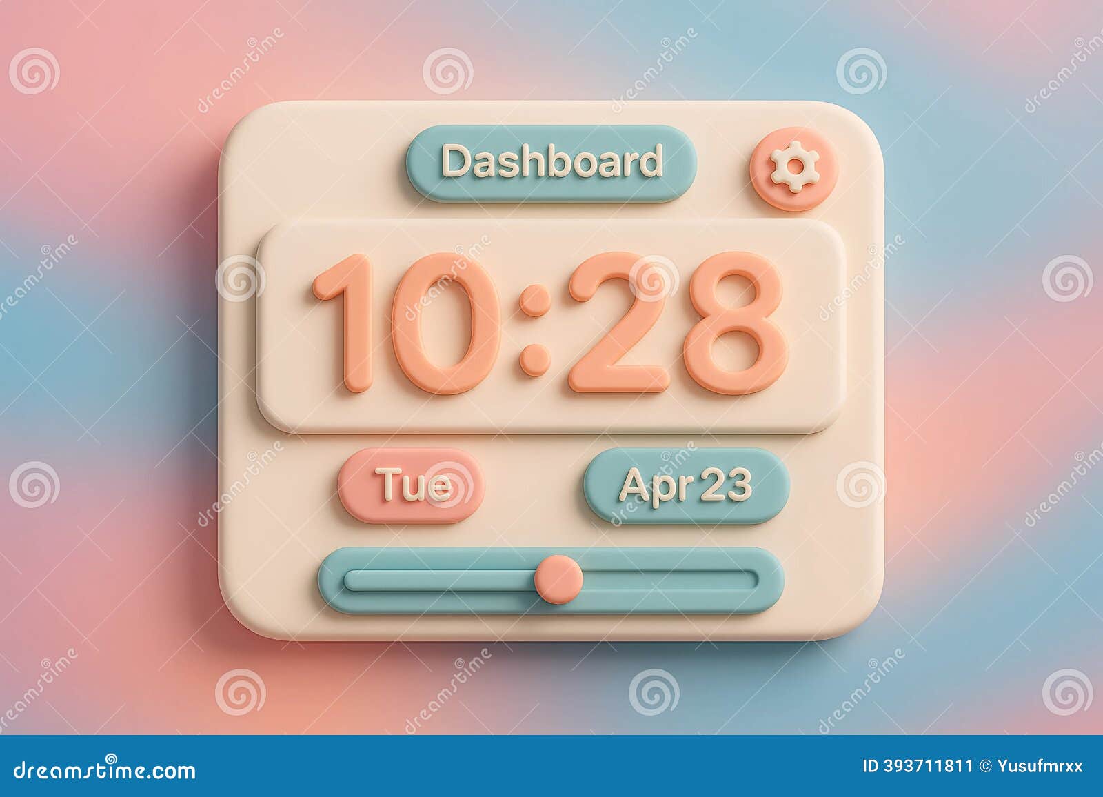
Yup, that was it! My mind instantly started layering inset shadows and defining vars to make it easy to reuse. Since this image is an AI generated image, I assumed code for a UI like this had never been written. And so I began.
Layering Shadows
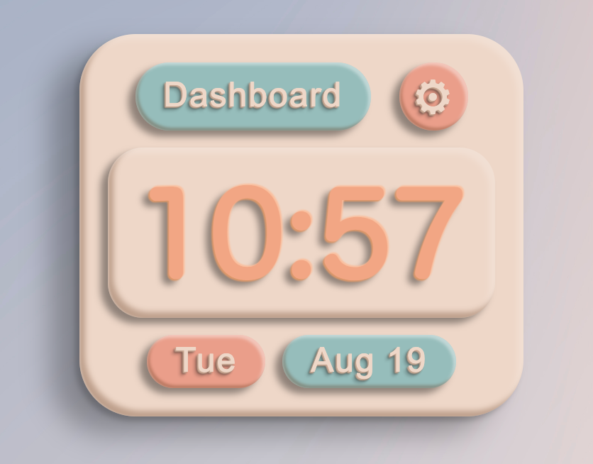
Examining the base card in the image above, we can see 5 main shadows.
- A drop shadow with a large blur
- A secondary drop shadow with less blur and less spread
- A dark inset shadow darkening the bottom and left edges
- A light inset shadow highlighting the right and top edges
- Another small inset shadow to simulate a rim light along the bottom and left edges
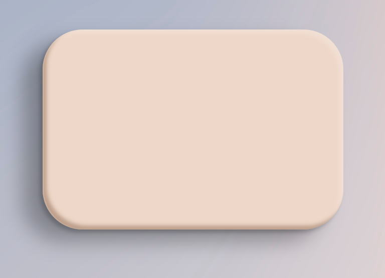
Here are the shadows for the main card:
:root {
  --card-inset-shadow: inset 4px -4px 4px 0px rgba(91, 46, 16, 0.329);
  --card-inset-highlight: inset -4px 4px 4px 0px rgba(255, 255, 255, 0.2);
  --card-inset-rimlight: inset 1px 0px 1px 0px rgba(255, 255, 255, .2);
  --card-drop-shadow: -20px 12px 20px rgba(0, 0, 0, 0.3);
  --card-drop-shadow-dark: -3px 3px 4px rgba(0, 0, 0, 0.2);
  --card-box-shadow: var(--card-inset-rimlight), var(--card-inset-shadow), var(--card-inset-highlight), var(--card-drop-shadow), var(--card-drop-shadow-dark)
}
Remember that with CSS shadows, they are rendered in the order they are declared, with the first being the top layer. For some reason this seems backwards to me - I think I expect the first shadow to go down first, then the second on top of it, then the third, etc. So just remember the first shadow is on top. In our case, we want the rimlight to be on top of everything and the drop shadows to be in the back.
With a little background gradient and some sizing we end up with something like this:
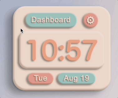
The nested card is a very similar as it’s made of the same ‘material’, but without the large drop shadow. Adding in styles for .card .card and adjusting the large drop shadow yields the following:
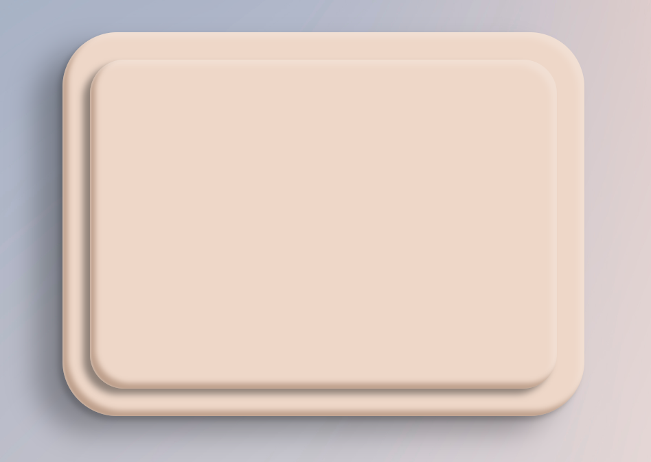
The shadows seem to be doing the trick! Those divs look moldable, like a couple nice little slabs of clay. Just what we wanted!
Styling Text
Let’s move on to styling the text - in particular, the text in the nested card showing the time. For now, we’ll keep it static, but making it dynamic with a touch of JS would be trivial. The drop shadow for this text ends up being the same as the nested card drop shadow - nice. However, this is where we start hitting the limits of what’s possible with CSS.
If we could add an inset shadow to the text, we could make the text look bubbly and inflated. However, browsers don’t support having inset shadows on text. To get the text to look somewhat rounded, we’re going to use the old trick used on the Apple website from 2007-2014. By adding two drop shadows, one dark and one light, in opposite directions it gives the appearance of raised text.
.clay-text {
  color: #ea9e8a;
  --text-dark-shadow: -1px 1px 1px #dd986a;
  --text-light-shadow: 1px -1px 1px #fabf9e;
  --text-shadow: var(--text-light-shadow), var(--text-dark-shadow), var(--nested-card-drop-shadow);
  text-shadow: var(--text-shadow);
}
With the text shadows in, the page looks much more interesting:
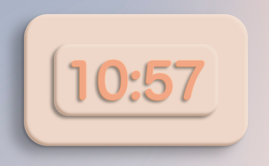
Definitely not perfect, but acceptable. Sure an SVG could make it perfect, and a collection of styled divs could make those shapes with the right gradients, but then that’s hardly reusable styles for general text and fonts. Maybe it’s worth doing some experimenting with transparent pseudo elements with duplicate text and clip-background, but for now this will do.
Adding Variations
Now that we have the basics building blocks of text and block-level elements we are ready to build! Add some color classes for the cards, smaller text (with scaled down shadows), and some layout to bring the interface to life.
For the buttons it’s a slight variation on cards, then some minor styles for a hover effect:
:root {
  --button-drop-shadow: -5px 4px 5px rgba(0, 0, 0, 0.4)
  --button-drop-shadow-hover: -6px 5px 5px rgba(0, 0, 0, 0.35)
  --button-inset-shadow: inset 2px -2px 2px 0px #5b2e1054
  --button-inset-highlight: inset -2px 2px 2px 0px rgba(255, 255, 255, 0.4)
  --button-inset-keylight: inset 1px 0px 1px 0px rgba(255, 255, 255, .2)
  --button-box-shadow: var(--button-inset-keylight), var(--button-inset-shadow), var(--button-inset-highlight), var(--button-drop-shadow)
  --button-box-shadow-hover: var(--button-inset-keylight), var(--button-inset-shadow), var(--button-inset-highlight), var(--button-drop-shadow-hover)
}
Animations
Adding a few transition states for the buttons makes the site feel more useful. The only thing to remember when animating rotations on things with drop shadows is to make sure you rotate the drop shadow the opposite direction. For instance, if you have a drop shadow toward the bottom left of an element and you rotate(45deg), the drop shadow needs to animate to the bottom right over the same time interval. This way the shadow doesn’t end up where it shouldn’t, which would break the global illumination effect we have going.
By adjusting the scale and the drop shadow, we can make it appear as if the hovered element lifts off the layer behind it.
Form Elements
From these basics we can start styling other common web patterns. We have links and buttons, text and containers, so now let’s do some form elements. For this UI, we will require the label to wrap the input. This will give us a consistant container that can be styled, as most form elements can’t have pseudo elements as they’re rendered by the host OS.
Adding an hr and styles for form inputs and labels gives a reasonably usable framework. If you’re wanting a playful form to collect feedback, reviews, or email addresses, this is all you’d need.
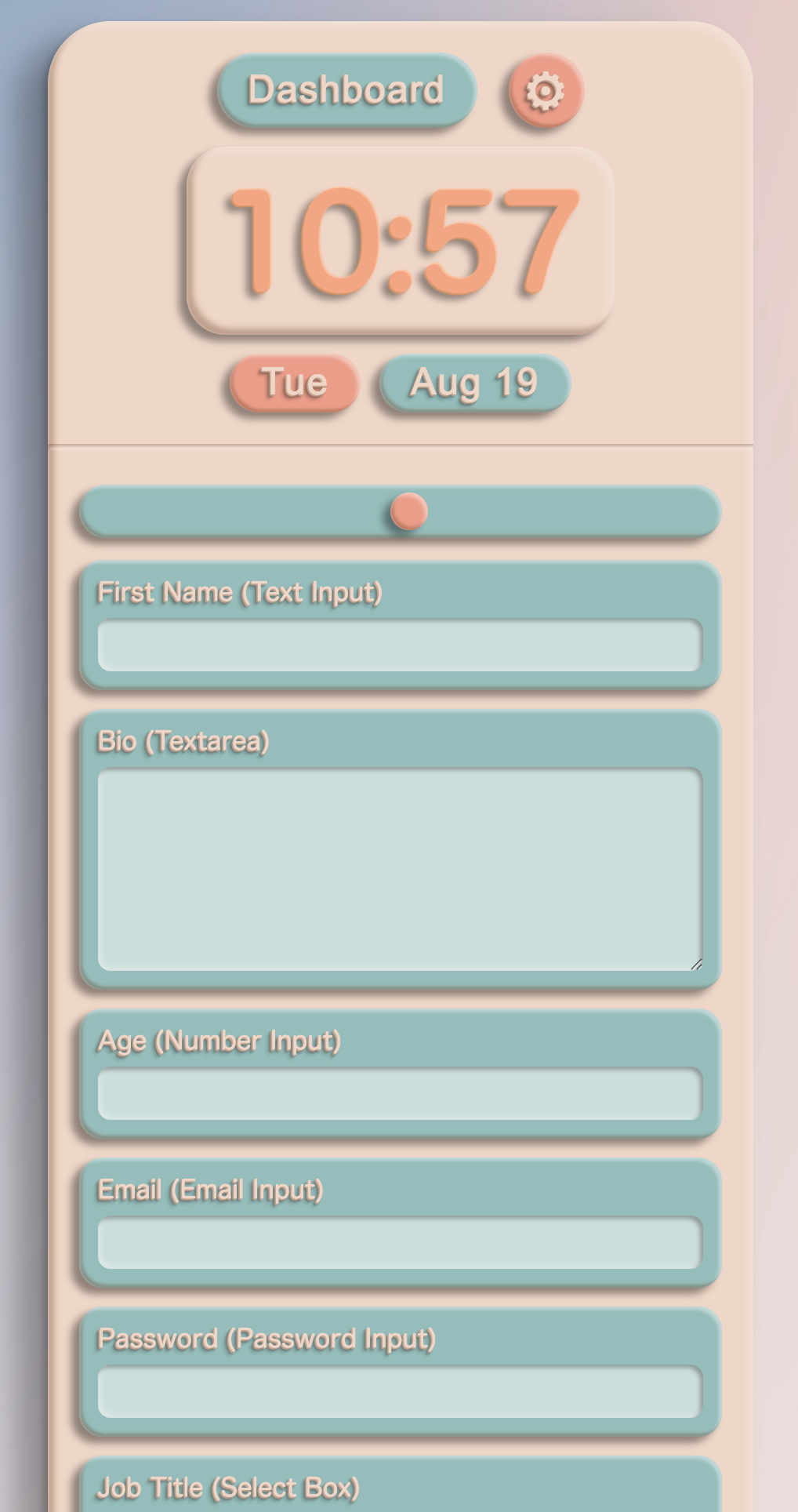
You’d need a bit of adjusting to make it work cross-platform e.g. the glyph I chose for the cog ⚙ is rendered differently depending on available system fonts.
Comparison and Conclusion
In my research for clay inspired UIs I quickly found the term “claymorphism”, coined by Michal Malewicz a few years back. I hadn’t heard the term before but recognized the style as soon as I saw an example. For instance, Smith’s Food and Drug use claymorphic characters in a lot of their advertising, and as I started to look at ads and logos, there really is quite a bit of claymorphism in the wild.
I doubt this project is going to be helpful for anyone, but it was an enjoyable journey for this old developer.
Here’s the AI generated image and the CSS version side by side:
You can view the Claymorph Example Page or you can check out the Claymorph UI repo on Github.
Updates
After writing this post, I came across a Claymorph CSS Generator tool. It uses a different combination of shadows and favors transparency, but if you’re looking to do play with some claymorph designs of your own it might save you some time.