CSS Autumn Pumpkin

Motivation
It’s Fall! I love Fall. It’s been Fall for a couple weeks, but it hasn’t felt like Fall until this week at my place. Leaves are changing colors, the mountain tops are getting dusted in snow, and decorations are adorning lawns. Also, it’s my Mother’s birthday today (Happy Birthday, Mom!) and her pumpkin soup often marked the start of autumn when I was growing up.
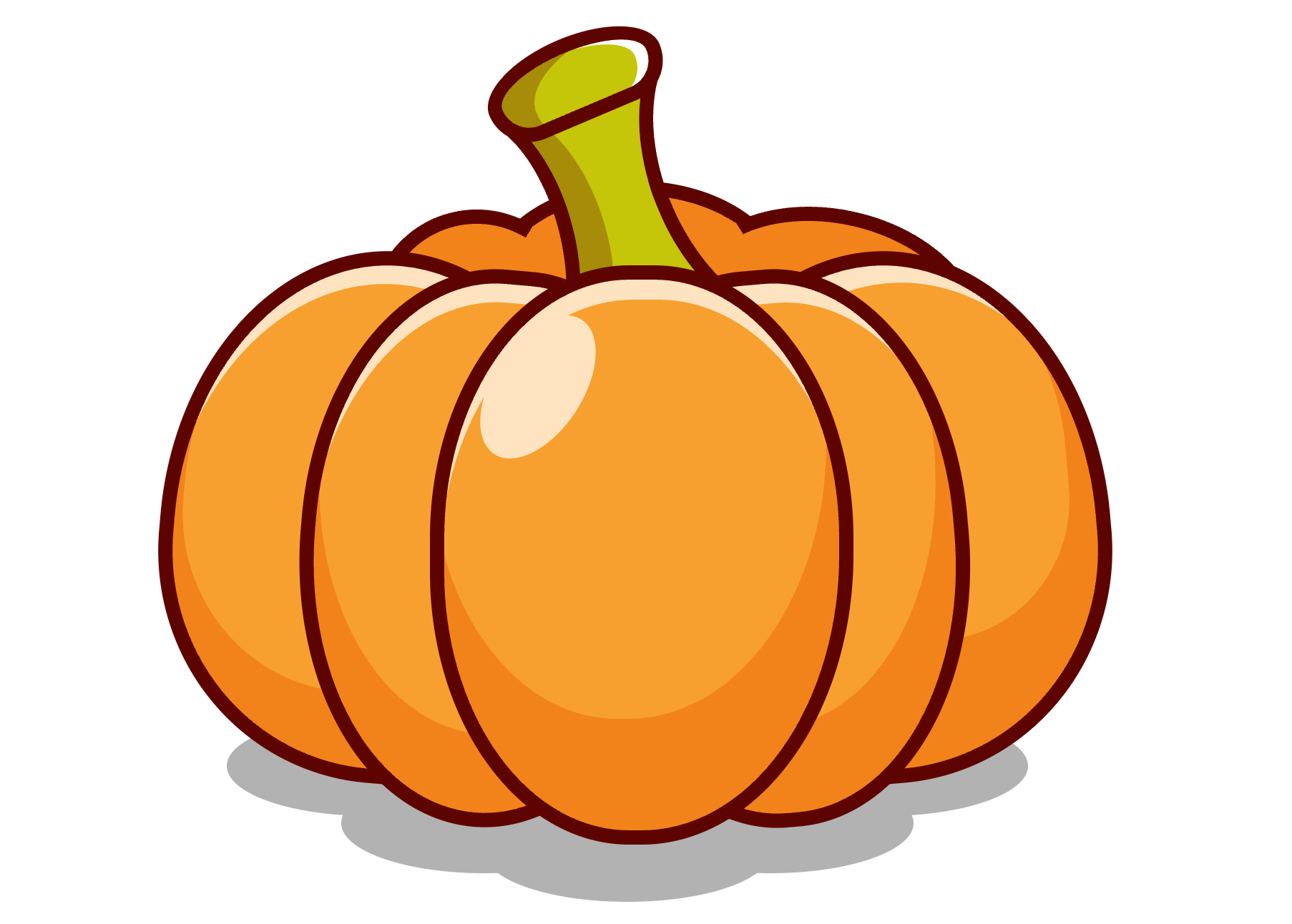
For this post, we’re going to be making a pumpkin using CSS. We’ll use some of the shapes from last week’s CSS Shapes post, and also make use of some shadow techniques (similar to those in the Claymorphism post) to layer different colors to give a rounded look.
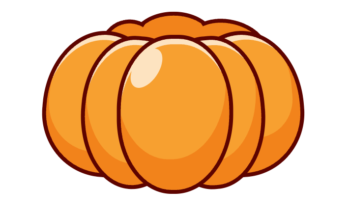
Here’s what we’ll be making:
Markup
First, let’s put down all the markup to get an idea of what we’ll be styling.
<div class="pumpkin">
  <div class="pumpkin1"></div>
  <div class="pumpkin2"></div>
  <div class="pumpkin3"></div>
  <div class="pumpkin4"></div>
  <div class="pumpkin5"></div>
  <div class="pumpkinBack"></div>

  <div class="stem"></div>

  <div class="shadow"></div>
</div>
The five ‘pumpkin’ divs will be the sections of the pumpkin, the ‘pumpkinBack’ div will be the shape behind the stem, and obviously the ‘stem’ and ‘shadow’ will be the stem and the shadow of the pumpkin.
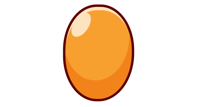
The First Section
Let’s start with the frontmost section of the pumpkin. It’s mostly an oval, with an inset shadow for the darker bottom, and another inset shadow for the lighter highlight across the top. The specular highlight will be a pseudo element.
Here’s the variables we’ll be using:
:root {
  --orange-base: #f7a030;
  --orange-dark: #f2831b;
  --orange-highlight: #fde3c0;
  --outline: #5e0400;
  --green-base: #c5c50a;
  --green-dark: #a68c08;
}
There’s a lot of magic numbers when you are making art pieces with CSS. I’ve often found it easiest to use pixels as units, with a font-based unit after that. Percentages get tricky when you’re having nested elements that need to relate to another nested element, as the basis could be different. So for this, we’ll use pixels and use CSS transform if we want to resize the image.
This is for the complicated front lobe:
.pumpkin1 {
  width: 276px;
  height: 385px;
  background-color: var(--orange-base);
  border-radius: 47%;
  position: absolute;
  top: 275px;
  left: 262px;
  border: 10px solid var(--outline);
  border-bottom-right-radius: 50%;
  z-index: 10;
  box-shadow: inset -9px -78px 0 0 var(--orange-dark), inset 3px 20px 0 -6px var(--orange-highlight);

  &:after {
    content: "";
    width: 63px;
    height: 112px;
    background-color: var(--orange-highlight);
    position: absolute;
    top: 19px;
    left: 34px;
    border-radius: 50%;
    transform: rotate(33deg);
    z-index: 11;
  }
}
Which gives us an egg with pumpkin-ish aspirations.
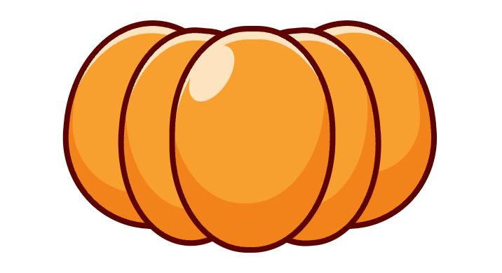
The Lobes
The other lobes are simpler than the first as they don’t have the highlight. We’ll just have the two shadows. Also, organic things work best if they’re mostly symmetrical, but not perfectly so. You’ll notice these lobes aren’t quite mirrors of eachother, but close.
.pumpkin2 {
  width: 251px;
  height: 370px;
  background-color: var(--orange-base);
  border-radius: 47%;
  position: absolute;
  top: 278px;
  left: 368px;
  border: 10px solid var(--outline);
  border-bottom-right-radius: 50%;
  transform: rotate(-5deg);
  z-index: 9;
  box-shadow: inset -9px -60px 0 0 var(--orange-dark), inset 7px 20px 0 -6px var(--orange-highlight);
}
.pumpkin3 {
  width: 251px;
  height: 370px;
  background-color: var(--orange-base);
  border-radius: 47%;
  position: absolute;
  top: 278px;
  left: 171px;
  border: 10px solid var(--outline);
  border-bottom-right-radius: 50%;
  transform: rotate(5deg);
  border-bottom-left-radius: 52%;
  border-top-left-radius: 48%;
  z-index: 9;
  box-shadow: inset -1px -55px 0 0 var(--orange-dark), inset 2px 19px 0 -6px var(--orange-highlight);

}
.pumpkin4 {
  width: 334px;
  height: 352px;
  background-color: var(--orange-base);
  position: absolute;
  top: 267px;
  left: 74px;
  border: 10px solid var(--outline);
  transform: rotate(5deg);
  z-index: 8;
  border-top-right-radius: 57% 90%;
  border-bottom-right-radius: 50% 10%;
  border-top-left-radius: 43% 53%;
  border-bottom-left-radius: 45% 44%;
  box-shadow: inset 0px 19px 0 -6px var(--orange-highlight), inset -23px -24px 0 28px var(--orange-dark);
}
.pumpkin5 {
  width: 334px;
  height: 352px;
  background-color: var(--orange-base);
  position: absolute;
  top: 267px;
  left: 383px;
  border: 10px solid var(--outline);
  transform: rotate(-5deg);
  z-index: 8;
  border-top-left-radius: 57% 90%;
  border-bottom-left-radius: 50% 10%;
  border-top-right-radius: 43% 53%;
  border-bottom-right-radius: 45% 44%;
  box-shadow: inset 11px 19px 0 -6px var(--orange-highlight), inset 30px -40px 0 47px var(--orange-dark);
}
Back
The back of the pumpkin (behind the stem) is similar to the ‘cloud’ in the CSS Shapes post, except it uses pseudo elements for the segments. We put a border along only the top of each shape and then position and rotate them to line up correctly.
.pumpkinBack {
  width: 199px;
  height: 138px;
  background-color: var(--orange-dark);
  position: absolute;
  top: 216px;
  left: 297px;
  border-top: 10px solid var(--outline);
  border-right: 10px solid transparent;
  border-bottom: 10px solid transparent;
  border-left: 10px solid transparent;
  border-radius: 50%;
  z-index: 1;

  &:after {
    content: "";
    width: 193px;
    height: 128px;
    background-color: var(--orange-dark);
    position: absolute;
    border-radius: 50%;
    top: 10px;
    left: 130px;
    border-top: 10px solid var(--outline);
    border-right: 10px solid transparent;
    border-bottom: 10px solid transparent;
    border-left: 10px solid transparent;
    transform: rotate(13deg);
  }

  &:before {
    content: "";
    width: 129px;
    height: 128px;
    background-color: var(--orange-dark);
    position: absolute;
    border-radius: 50%;
    top: 10px;
    left: -87px;
    border-top: 10px solid var(--outline);
    border-right: 10px solid transparent;
    border-bottom: 10px solid transparent;
    border-left: 10px solid transparent;
    transform: rotate(-13deg);
  }
}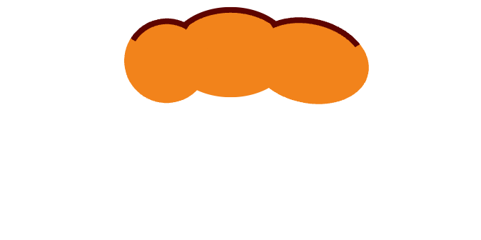
When shown with the rest of the lobes and adjusted z-indexes, we get a nice stemless, floating pumpkin.
Now that’s looking festive!
Stem
The stem is trickier than the other parts of the pumpkin, as it has ‘concave’ sides. All the shapes so far are ‘convex, meaning if you wrapped a rubber band around a shape, the shape of the rubber band would match the underlying shape. If a shape has a ‘concave’ side, the rubber band would not quite match. A star is a good example of a shape with concave sides.
To make concave curves in CSS, one technique is to place a shape with a transparent background, then add a drop shadow to the shape. If the drop shadow has a hard edge (‘0’ blur parameter) you can make some fairly decent concave shapes. However, they are limited to the shape and size of the original shape, so sometimes you have to get creative.
Our stem is a single div with both pseudo elements being used.
.stem {
  width: 141px;
  height: 215px;
  background-color: transparent;
  position: absolute;
  top: 90px;
  left: 416px;
  border-radius: 50%;
  box-shadow: -65px 0px 0 0 var(--green-base);
  z-index: 1;
  border-left: 10px solid var(--outline);
  border-top: 10px solid transparent;
  border-bottom: 10px solid transparent;
  transform: rotate(-23deg);

  &:after {
    content: "";
    width: 100px;
    height: 179px;
    background-color: transparent;
    position: absolute;
    top: -15px;
    left: -179px;
    border-radius: 50%;
    box-shadow: 22px 10px 0 0 var(--green-dark);
    z-index: 2;
    border-right: 10px solid var(--outline);
    border-top: 10px solid transparent;
    border-bottom: 10px solid transparent;
    transform: rotate(8deg);
  }

  &:before {
    z-index: 3;
    content: "";
    width: 109px;
    height: 40px;
    background-color: var(--green-base);
    border: 10px solid var(--outline);
    position: absolute;
    top: -30px;
    left: -93px;
    border-bottom-right-radius: 30px;
    border-top-right-radius: 50%;
    border-bottom-left-radius: 30px;
    border-top-left-radius: 50%;
    box-shadow: inset 36px 11px 0 -15px var(--green-dark), inset -11px 1px 0 -2px white;
  }
}
Do you see the three shapes? Here’s the stem exploded and with gray borders so you can see the edges of the shapes.
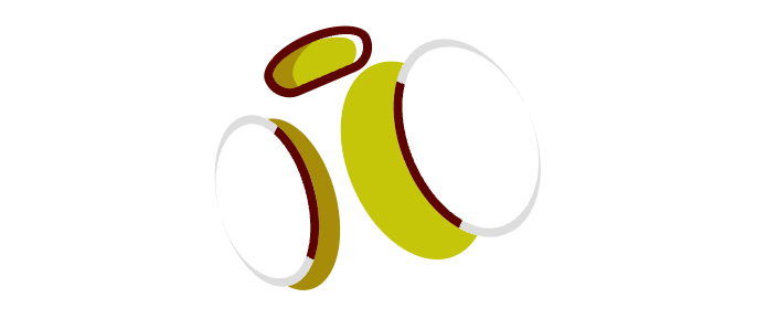
The main element is the right edge with the light green drop shadow extending to the left. The :after is the left edge, and the :before is the round top. With some magic numbers to line things up, and after tucking the stem behind the front lobes of the pumpkin, it’s really “shaping” up.
Shadow
To ground the pumpkin, we need to add a shadow. It looks pretty good now, but a shadow really helps to anchor the graphic.
This shape is literally just the cloud technique from the CSS Shapes post.
.shadow {
width: 200px;
height: 70px;
background-color: #666;
position: absolute;
top: 650px;
left: 300px;
z-index: 2;
opacity: 0.5;
border-radius: 50%;
box-shadow: 100px -20px 0 0 #666, 180px -60px 0 0 #666, -100px -20px 0 0 #666, -180px -60px 0 0 #666;
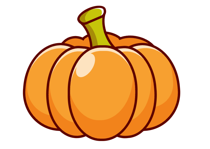
}And just like that we have a fancy tribute to Fall and Mom’s homemade pumpkin soup:
Conclusion
This could be done with fewer elements for sure. Since most of the lobes don’t need their pseudo elements, we could move some of the ‘div’s to be based off other elements. But this is reasonable.
In a future post, we’ll make an environment for this pumpkin to rest. See you soon!
You can view the CSS Autumn Pumpkin Example Page where you can inspect and fiddle with the source code, or you can check out the CSS Autumn Pumpkin repo on Github.