CSS Autumn Leaf

Motivation
Hooray for Fall! Yesterday my kids raked up the first pile of leaves that fell from our trees. The entire backyard yielded a knee-high pile, but they found it delightful. Continuing with last week’s theme, we’ll be building a festive autumn leaf.
For this post, we’ll use some of the shapes from the CSS Shapes post, so if you haven’t looked that one over, I recommend checking it out.
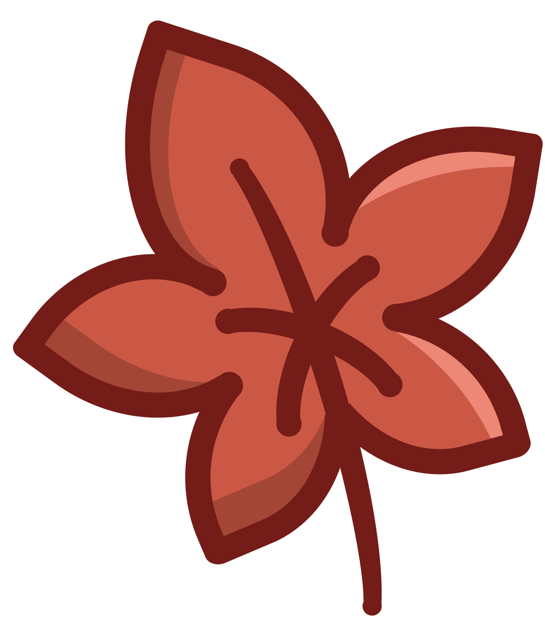
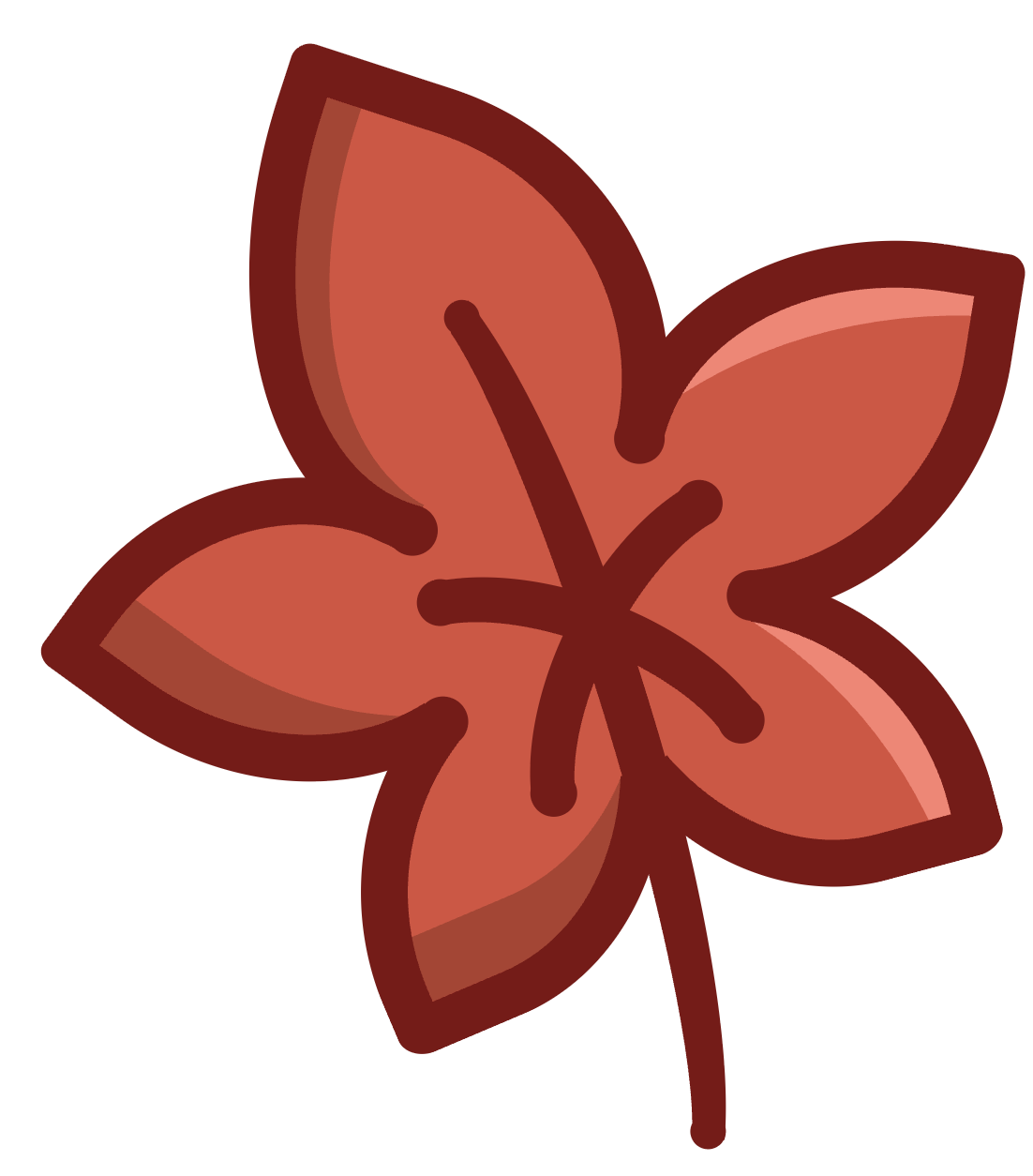
Here’s what we’ll be making:
Markup
First of all, here’s all the markup for a leaf.
<div class="leaf">
  <div class="top"></div>
  <div class="right"></div>
  <div class="left"></div>
  <div class="stem"></div>
</div>
The ‘top’ div is the main lobe of the leaf, but also has some pseudo elements that are also the ‘top’ layer on the z axis. These pseudo elements help hide some seams and rough ends.
The ‘left’ and ‘right’ divs are for the side lobes, and the stem is the rest of the dark lines.
The Top Lobe
We’ll build the top, the sides, then the stem. Here’s the palette we’ll be working with:
:root {
  --leaf-red-color: #db4e3c;
  --leaf-red-color-dark: #b03e2e;
  --leaf-red-color-highlight: #fd8070;
  --leaf-orange-color: #f7a030;
  --leaf-orange-color-dark: #f2831b;
  --leaf-orange-color-highlight: #fde3c0;
  --leaf-green-color: #c5c50a;
  --leaf-green-color-dark: #a68c08;
  --leaf-green-color-highlight: #fde3c0;
  --leaf-yellow-color: #f2db2e;
  --leaf-yellow-color-dark: #bdab1e;
  --leaf-yellow-color-highlight: #f3e78c;
  --outline-color: #7e1012;
}
As with the Autumn Pumpkin Post (or any other art piece in CSS), there are a lot of magic numbers used to align the various shapes.
Here’s the CSS for the ‘top’:
.top {
  width: 202px;
  height: 192px;
  border: 25px solid var(--outline-color);
  border-top-left-radius: 5%;
  border-top-right-radius: 76%;
  border-bottom-left-radius: 62% 100%;
  border-bottom-right-radius: 51% 40%;
  background-color: var(--leaf-color);
  position: absolute;
  top: 91px;
  left: 135px;
  transform: rotate(18deg);
  box-shadow: inset 19px 0px 0 0 var(--leaf-color-dark);
  z-index: 5;
}
And here’s the result:
You see there’s the dark border all the way around. We’ll cover up the parts of the border we don’t want to see a bit later.
The Right and Left
As we position the other lobes, take care to make each one a little different. Even though nature is organized, it’s usually not perfectly symmetrical.
.right {
  width: 167px;
  height: 152px;
  border: 25px solid var(--outline-color);
  border-top-left-radius: 5%;
  border-top-right-radius: 77%;
  border-bottom-left-radius: 64% 83%;
  border-bottom-right-radius: 39% 27%;
  background-color: var(--leaf-color);
  position: absolute;
  top: 165px;
  left: 343px;
  transform: rotate(99deg);
  box-shadow: inset 132px -54px 0 -124px var(--leaf-color-highlight);

  &:after {
    content: "";
    width: 156px;
    height: 139px;
    border: 25px solid var(--outline-color);
    border-top-left-radius: 8% 7%;
    border-top-right-radius: 68% 92%;
    border-bottom-left-radius: 76% 83%;
    border-bottom-right-radius: 15% 5%;
    background-color: var(--leaf-color);
    position: absolute;
    top: -26px;
    left: 140px;
    transform: rotate(66deg);
    box-shadow: inset 132px -54px 0 -124px var(--leaf-color-highlight);
  }
}
.left {
  width: 165px;
  height: 135px;
  border: 25px solid var(--outline-color);
  border-top-left-radius: 5%;
  border-top-right-radius: 77%;
  border-bottom-left-radius: 64% 83%;
  border-bottom-right-radius: 39% 27%;
  background-color: var(--leaf-color);
  position: absolute;
  top: 283px;
  left: 72px;
  transform: scaleX(-1) rotate(144deg);
  box-shadow: inset 10px 81px 0 -50px var(--leaf-color-dark);

  &:after {
    content: "";
    width: 156px;
    height: 139px;
    border: 25px solid var(--outline-color);
    border-top-left-radius: 8% 7%;
    border-top-right-radius: 68% 92%;
    border-bottom-left-radius: 76% 83%;
    border-bottom-right-radius: 15% 5%;
    background-color: var(--leaf-color);
    position: absolute;
    top: -41px;
    left: 133px;
    transform: rotate(59deg);
    box-shadow: inset 18px 51px 0 -15px var(--leaf-color-dark);
  }
}
And there’s the base of the art! Now it’s on to cleanup.

Cover Up
Since we didn’t use any pseudo elements of the ‘top’, let’s use one now to cover up the parts of the border that we don’t want to see.
.top {
  ...
  &:after {
    content: "";
    width: 190px;
    height: 193px;
    background-color: var(--leaf-color);
    position: absolute;
    top: 119px;
    left: 113px;
    border-radius: 50%;
  }
}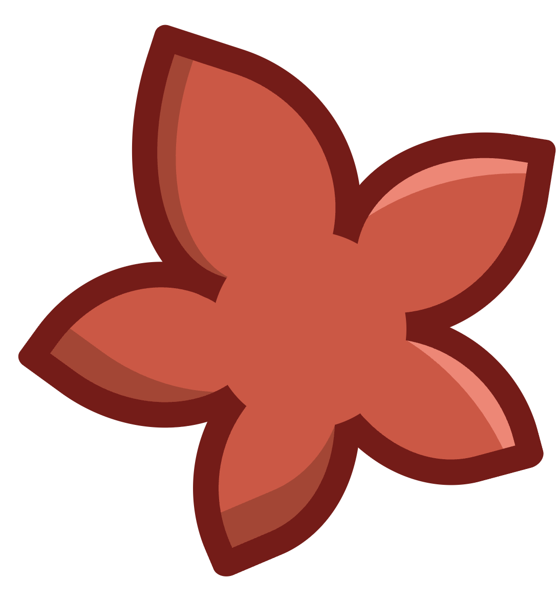
And now it’s leaf-ish!
Stem
The stem is made up of shapes with a border on only one side. The main stem element is the long stroke down the middle, and the pseudo elements are the other stem segments.
.stem {
  width: 61px;
  height: 478px;
  border: 25px solid transparent;
  border-right: 25px solid var(--outline-color);
  position: absolute;
  top: 165px;
  left: 258px;
  border-radius: 0% 100% 100% 0%;
  z-index: 5;
  transform: rotate(-17deg);

  &:after {
    content: "";
    width: 83px;
    height: 192px;
    border: 25px solid transparent;
    border-right: 25px solid var(--outline-color);
    position: absolute;
    top: 113px;
    left: -25px;
    border-radius: 10% 90% 90% 10%;
    transform: rotate(-52deg);
  }

  &:before {
    content: "";
    width: 83px;
    height: 192px;
    border: 25px solid transparent;
    border-right: 25px solid var(--outline-color);
    position: absolute;
    top: 109px;
    left: 40px;
    border-radius: 10% 90% 90% 10%;
    transform: rotate(-136deg);
  }
}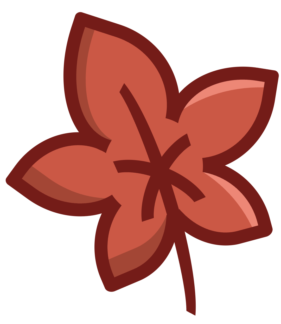
Cleanup
We’ll take care of all those sharp edges with a single element. We’ll use the other pseudo element before of the top div to place circles at the joins and ends of the outline of the leaf and stem. This makes it look a lot more finished.
&:before {
  content: "";
  width: 27px;
  height: 27px;
  background-color: var(--outline-color);
  position: absolute;
  top: 192px;
  left: 101px;
  border-radius: 50%;
  z-index: 1;
  box-shadow:
    100px -84px 0px 0px var(--outline-color),
    183px -23px 0 0 var(--outline-color),
    47px 92px 0 0 var(--outline-color),
    115px 110px 0 -1px var(--outline-color),
    26px 32px 0 -1px var(--outline-color),
    198px 42px 0 -1px var(--outline-color),
    141px -61px 0 -1px var(--outline-color),
    -10px -116px 0 -4px var(--outline-color),
    249px 256px 0 -4px var(--outline-color)
}
Variations
Since we used variables for the colors, we can change the color of other leaves easily.
.leaf:nth-child(1) {
  -~-leaf-color: var(--leaf-orange-color);
  --leaf-color-dark: var(--leaf-orange-color-dark);
  --leaf-color-highlight: var(--leaf-orange-color-highlight);
}

.leaf:nth-child(2) {
  --leaf-color: var(--leaf-green-color);
  --leaf-color-dark: var(--leaf-green-color-dark);
  --leaf-color-highlight: var(--leaf-green-color-highlight);
}

.leaf:nth-child(3) {
  --leaf-color: var(--leaf-yellow-color);
  --leaf-color-dark: var(--leaf-yellow-color-dark);
  --leaf-color-highlight: var(--leaf-yellow-color-highlight);
}
And with a little positioning, we end up with:

Happy Fall!
Conclusion
In a future post, we’ll combine these fall decorations into a festive scene. See you soon!
You can view the CSS Autumn Leaf Example Page where you can inspect and fiddle with the source code, or you can check out the CSS Autumn Leaf repo on Github.