Trick-or-Treat CSS

Motivation
As Halloween gets closer, let’s build on the last few posts (CSS Autumn Leaf and CSS Autumn Pumpkin) to make a fun little scene to celebrate. And it wouldn’t be Halloween without Trick-or-treating, and it wouldn’t be without a little trick :)
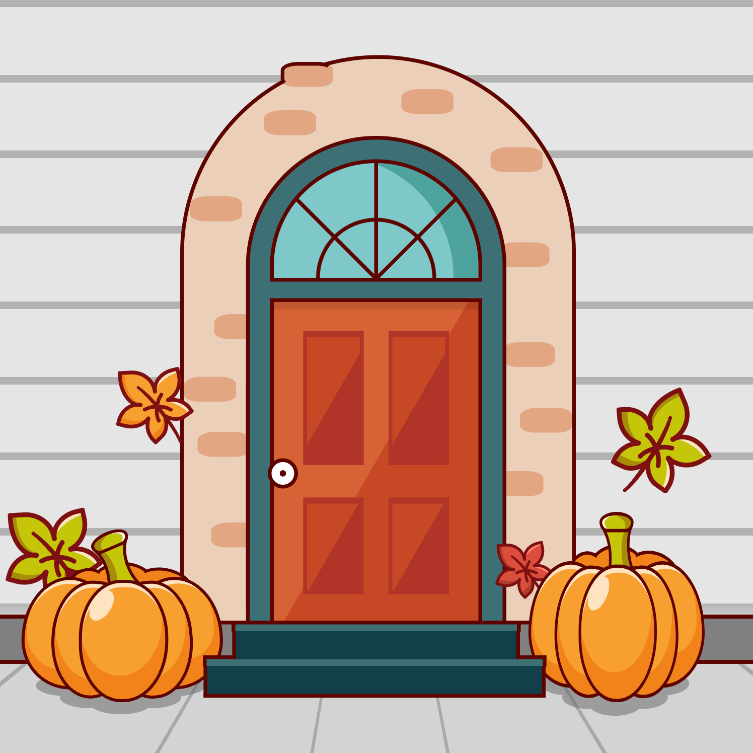
Here’s a screenshot of what we’ll be making:
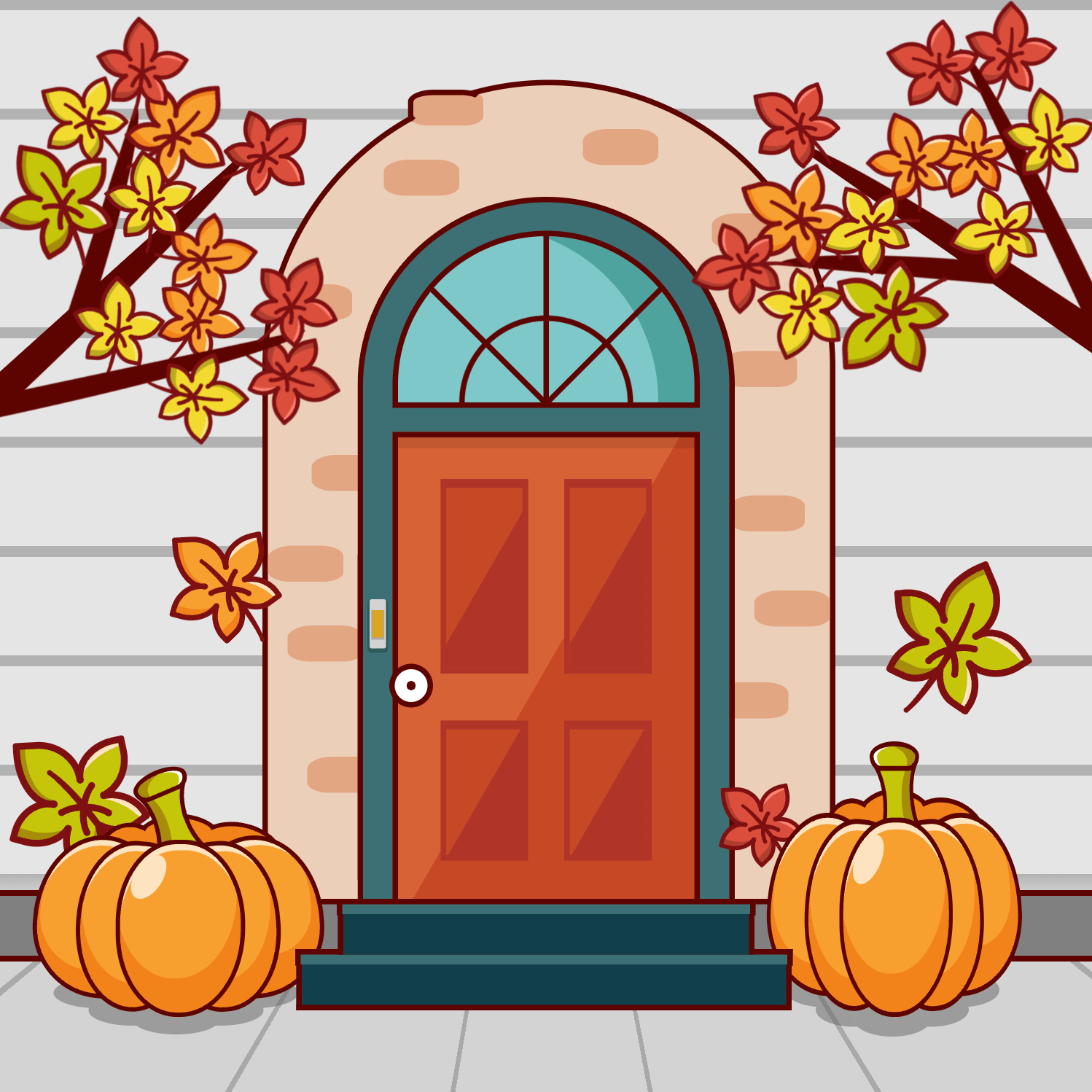
We’ll outline each of the main objects with a border so it looks a bit like a coloring page. This does limit the number of shapes we can easily do (as all the border tricks are out) but it gives a fun clip-art feel.
Markup
There’s a lot of markup going into this scene, as each leaf is made of 4 divs and each pumpkin is made of 8. We’ll ignore those for now, but you can refer to the other posts for details on how those work. Here’s the markup for the house.
<div class="doorbell"></div>
<div class="bg"></div>
<div class="wall"></div>
<div class="door-frame"></div>
<div class="window"></div>
<div class="door">
  <div class="door-panel-small"></div>
  <div class="door-panel-large"></div>
</div>
<div class="top-step"></div>
<div class="bottom-step"></div>
The hierarchy is pretty flat, as we’re going to be restyling some items based on the :active state of the doorbell (spoiler alert!).
The Background
Our palette for the house looks like this:
:root {
--door-color: #c74825;
--door-color-dark: #b03428;
--door-color-highlight: #d76236;
--door-frame-color: #3d7074;
--door-frame-color-dark: #11404a;
--window-color: #7ec8c9;
--window-color-dark: #4ea39e;
--wall-color: #ebcfb9;
--wall-color-dark: #e2a682;
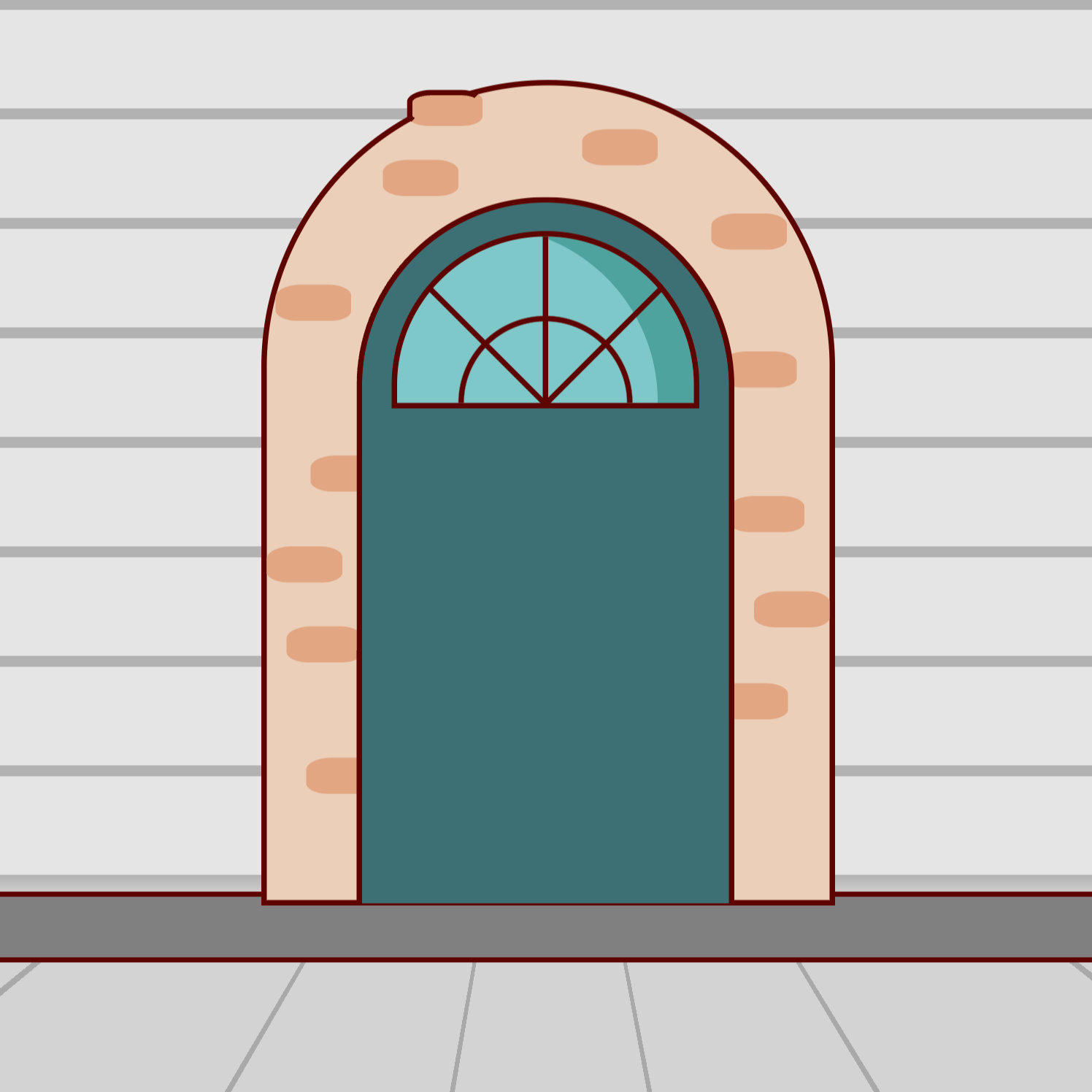
}I’ve covered most of the building block shapes in previous posts, so I’ll just go over the intersting bits. The background consists of the siding on the house, the cement foundation, and the sidewalk. This is all done with a single div .bg.
By stacking a few different gradients we can have a solid base to start building on. Here’s the CSS
.bg {
  position: absolute;
  top: 0;
  left: 0;
  width: 100%;
  height: 100%;
  background-image:
    linear-gradient(to top, transparent 0%, transparent 18.5%, rgba(0,0,0,.2) 18.5%,
      rgba(0,0,0,.3) 20%, rgba(0,0,0,.1) 20%,
      rgba(0,0,0,.1) 29%, rgba(0,0,0,.3) 29%,
      rgba(0,0,0,.3) 30%, rgba(0,0,0,.1) 30%,
      rgba(0,0,0,.1) 39%, rgba(0,0,0,.3) 39%,
      rgba(0,0,0,.3) 40%, rgba(0,0,0,.1) 40%,
      rgba(0,0,0,.1) 49%, rgba(0,0,0,.3) 49%,
      rgba(0,0,0,.3) 50%, rgba(0,0,0,.1) 50%,
      rgba(0,0,0,.1) 59%, rgba(0,0,0,.3) 59%,
      rgba(0,0,0,.3) 60%, rgba(0,0,0,.1) 60%,
      rgba(0,0,0,.1) 69%, rgba(0,0,0,.3) 69%,
      rgba(0,0,0,.3) 70%, rgba(0,0,0,.1) 70%,
      rgba(0,0,0,.1) 79%, rgba(0,0,0,.3) 79%,
      rgba(0,0,0,.3) 80%, rgba(0,0,0,.1) 80%,
      rgba(0,0,0,.1) 89%, rgba(0,0,0,.3) 89%,
      rgba(0,0,0,.3) 90%, rgba(0,0,0,.1) 90%,
      rgba(0,0,0,.1) 99%, rgba(0,0,0,.3) 99%,
      rgba(0,0,0,.3) 100%),
    linear-gradient(to top,
      transparent 0%,
      transparent 12%, var(--outline) 12%,
      var(--outline) 12.5%, gray 12.5%,
      gray 18%, var(--outline) 18%,
      var(--outline) 18.5%, white 18.5%),
    conic-gradient(from .3turn at 50% 50%,
      lightgray 20deg, darkgray 20deg,
      darkgray 20.5deg, lightgray 20.5deg,
      lightgray 40.5deg, darkgray 40.5deg,
      darkgray 41deg, lightgray 41deg,
      lightgray 61deg, darkgray 61deg,
      darkgray 61.5deg, lightgray 61.5deg,
      lightgray 81.5deg, darkgray 81.5deg,
      darkgray 82deg, lightgray 82deg,
      lightgray 102deg, darkgray 102deg,
      darkgray 102.5deg, lightgray 102.5deg,
      lightgray 122.5deg, darkgray 122.5deg,
      darkgray 123deg, lightgray 123deg,
      lightgray 143deg);
}
And here’s the result:
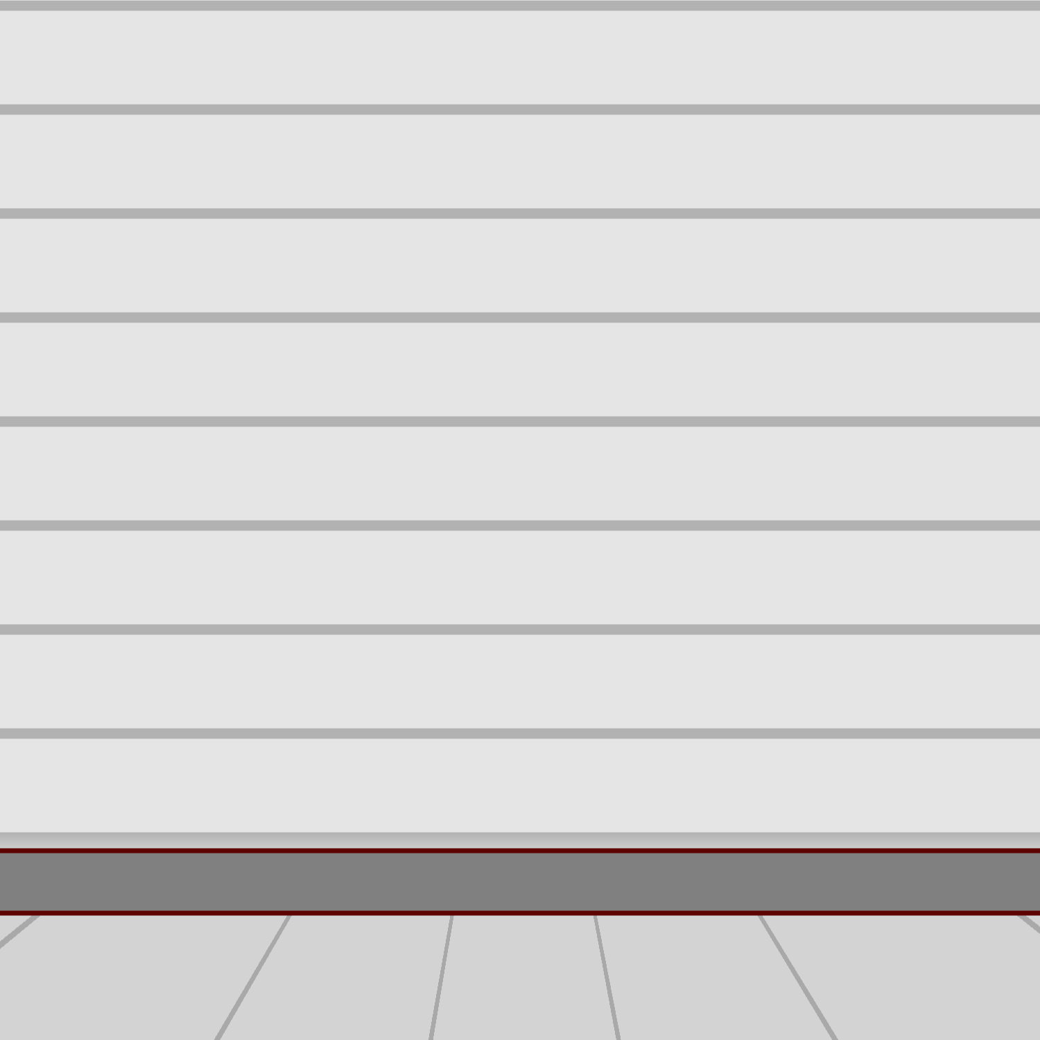
Remember that background-image layers stack from front to back, so whichever comes first is the front-most image, and the last image is ‘under’ all the others.
The far background conic-gradient creates the sidewalk with the divider lines. Each sidwalk slab is 20deg wide and each gap is .5deg wide.
The next linear-gradient is for the foundation and the ‘outline’ lines of the foundation. It also defines the base color of the wall - currently white.
The topmost linear-gradient applies a texture on top of the base color of the wall, giving the appearance of siding. This way I could play with different colors of siding easily, without having to adjust a giant gradient map.
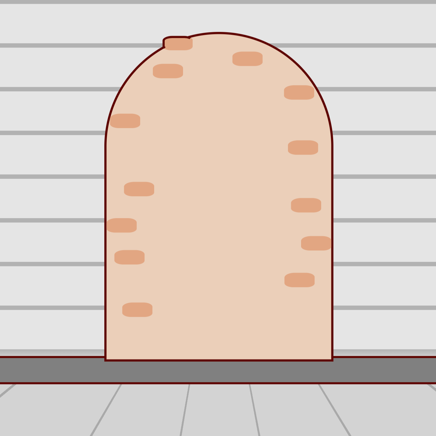
The Wall
Next up is the wall, which isn’t that interesting. The bricks are all drop-shadows off the master brick, which is a pseudo element. The master brick is the one that kinda juts out of the top.
.wall {
  width: 514px;
  height: 744px;
  background-color: var(--wall-color);
  border: 5px solid var(--outline);
  position: absolute;
  top: 74px;
  left: 240px;
  border-radius: 400px 400px 0% 0%;

  &:after {
    content: "";
    width: 69px;
    height: 33px;
    background-color: var(--wall-color-dark);
    position: absolute;
    top: 4px;
    left: 128px;
    border-radius: 34% 30% 27% 29%;
    border-left: 5px solid var(--outline);
    border-top: 5px solid var(--outline);
    border-right: 5px solid transparent;
    border-bottom: 5px solid transparent;
    box-sizing: border-box;

    box-shadow:
      160px 36px 0 0 var(--wall-color-dark),
      -22px 64px 0 0 var(--wall-color-dark),
      287px 239px 0 0 var(--wall-color-dark),
      294px 371px 0 0 var(--wall-color-dark),
      317px 458px 0 0 var(--wall-color-dark),
      279px 542px 0 0 var(--wall-color-dark),
      278px 113px 0 0 var(--wall-color-dark),
      -88px 334px 0 0 var(--wall-color-dark),
      -120px 178px 0 0 var(--wall-color-dark),
      -128px 417px 0 0 var(--wall-color-dark),
      -110px 490px 0 0 var(--wall-color-dark),
      -92px 610px 0 0 var(--wall-color-dark);
  }
}
The Door Frame
The door frame is uninteresting.
.door-frame {
  width: 335px;
  height: 640px;
  border-top-left-radius: 200px;
  border-top-right-radius: 200px;
  background-color: var(--door-frame-color);
  border: 5px solid var(--outline);
  border-bottom: none;
  position: absolute;
  top: 181px;
  left: 327px;
}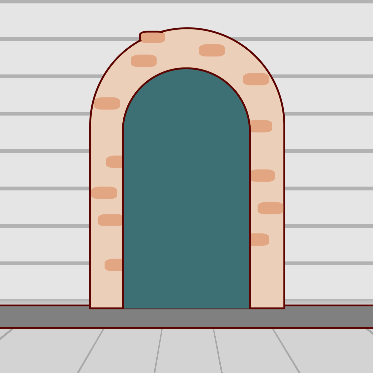
The Window
The window uses pseudo elements, a radial-gradient and an inset shadow to make the whole thing with a single div.
.window {
  width: 271px;
  height: 152px;
  background-color: var(--window-color);
  border: 5px solid var(--outline);
  position: absolute;
  top: 212px;
  left: 359px;
  border-top-right-radius: 200px;
  border-top-left-radius: 200px;
  box-shadow: inset -57px 15px 0 -24px var(--window-color-dark);
  background-image: radial-gradient(circle at 50% 100%, var(--window-color) 0%, var(--window-color) 74px, var(--outline) 75px, var(--outline) 79px, var(--window-color) 80px);

  &:after {
    content: "";
    width: 148px;
    height: 148px;
    border-left: 5px solid var(--outline);
    border-bottom: 5px solid var(--outline);
    transform: rotate(-45deg);
    position: absolute;
    top: -28px;
    left: 59px;
  }

  &:before {
    content: "";
    width: 5px;
    height: 152px;
    position: absolute;
    top: 0px;
    left: 133px;
    background-color: var(--outline);
  }
}
You may have noticed that on the horizontal lines of the siding gradient, we used the same percentage values at the transitions between colors. This gives a very crisp line. On a radial gradient though, you don’t really want a crisp line (as most browsers don’t anti-alias the edges where colors meet) so we have a 1px transition space between colors which gives a much better curve.
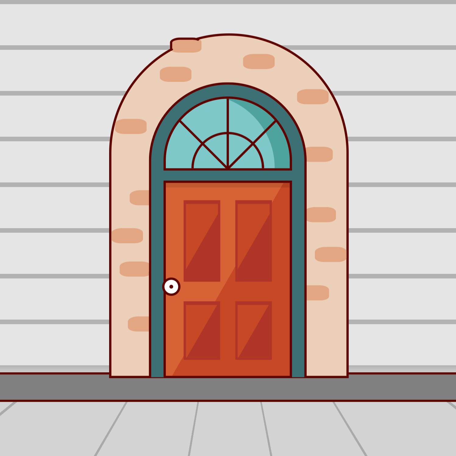
The Door
This is made of basic rectangles with linear-gradient backgrounds. The doorknob is a pseudo with a linear-gradient.
.door {
          width: 271px;
          height: 422px;
          border: 5px solid var(--outline);
          position: absolute;
          top: 396px;
          left: 359px;
          background-color: var(--door-color);
          background-image: linear-gradient( -60deg, var(--door-color) 0%, var(--door-color) 50%, var(--door-color-highlight) 50%);
          box-shadow: inset 0 10px rgba(0,0,0,.1);

          &:after {
            content: "";
            width: 30px;
            height: 30px;
            background-color: white;
            border: 5px solid var(--outline);
            position: absolute;
            top: 49%;
            left: -8px;
            background-image: radial-gradient(circle at 50% 50%, var(--outline) 0%, var(--outline) 19%, white 20%, white 100%);
            border-radius: 50%;
          }

          .door-panel-small {
            width: 70px;
            height: 115px;
            background-color: var(--door-color);
            border: 5px solid var(--door-color-dark);
            border-top: 8px solid var(--door-color-dark);
            position: absolute;
            top: 259px;
            left: 39px;
            background-image: linear-gradient( -60deg, var(--door-color-dark) 0%, var(--door-color-dark) 50%, var(--door-color) 50%);

            &:after {
              content: "";
              width: 70px;
              height: 115px;
              background-color: var(--door-color);
              border: 5px solid var(--door-color-dark);
              border-top: 8px solid var(--door-color-dark);
              position: absolute;
              left: 108px;
              top: -8px;
              background-image: linear-gradient( -60deg, var(--door-color-dark) 0%, var(--door-color-dark) 50%, var(--door-color) 50%);
            }
          }
          .door-panel-large {
            width: 70px;
            height: 165px;
            background-color: var(--door-color);
            border: 5px solid var(--door-color-dark);
            border-top: 8px solid var(--door-color-dark);
            position: absolute;
            top: 38px;
            left: 39px;
            background-image: linear-gradient( -60deg, var(--door-color-dark) 0%, var(--door-color-dark) 50%, var(--door-color) 50%);

            &:after {
              content: "";
              width: 70px;
              height: 165px;
              background-color: var(--door-color);
              border: 5px solid var(--door-color-dark);
              border-top: 8px solid var(--door-color-dark);
              position: absolute;
              left: 108px;
              top: -8px;
              background-image: linear-gradient( -60deg, var(--door-color-dark) 0%, var(--door-color-dark) 50%, var(--door-color) 50%);
            }
          }
        }
      }
The Steps
The steps aren’t very interesting.
.top-step {
  width: 373px;
  height: 10px;
  border-left: 5px solid var(--outline);
  border-right: 5px solid var(--outline);
  border-top: 5px solid var(--outline);
  border-bottom: none;
  position: absolute;
  top: 823px;
  left: 308px;
  background-color: var(--door-frame-color);
  z-index: 4;

  &:after {
    content: "";
    width: 371px;
    height: 37px;
    background-color: var(--door-frame-color-dark);
    border-left: 5px solid var(--outline);
    border-right: 5px solid var(--outline);
    position: absolute;
    top: 9px;
    left: -4px;
  }
}
The .bottom-step is just a slight variation of this one. You can see the full code in the Github repo linked at the end of the post.
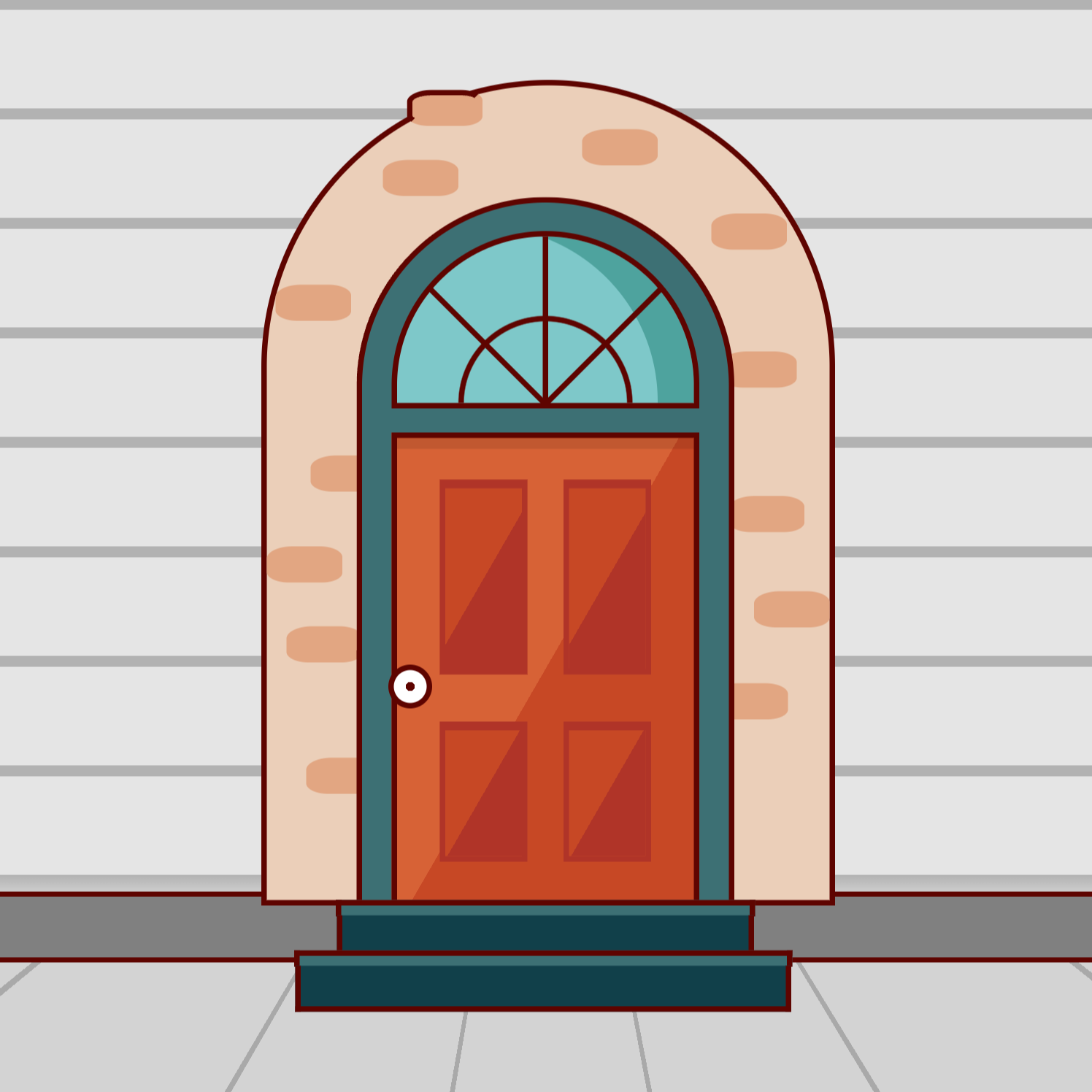
And with that, we’re ready to start composing this art with previous pieces, like the pumpkin and the leaf.
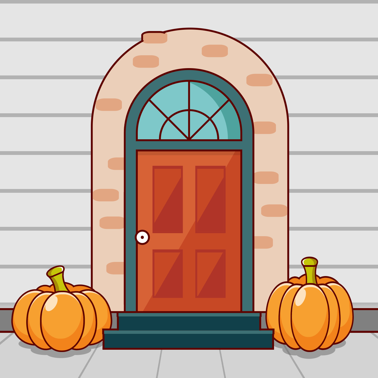
The Pumpkins
The pumpkins add a nice touch and tie the house to the sidewalk with a bit of perspective and a shadow. The position and size of the pumpkins is completely arbitrary, so place and scale them wherever you’d like!
The Leaves
Add in a few leaves in convenient places for decoration.
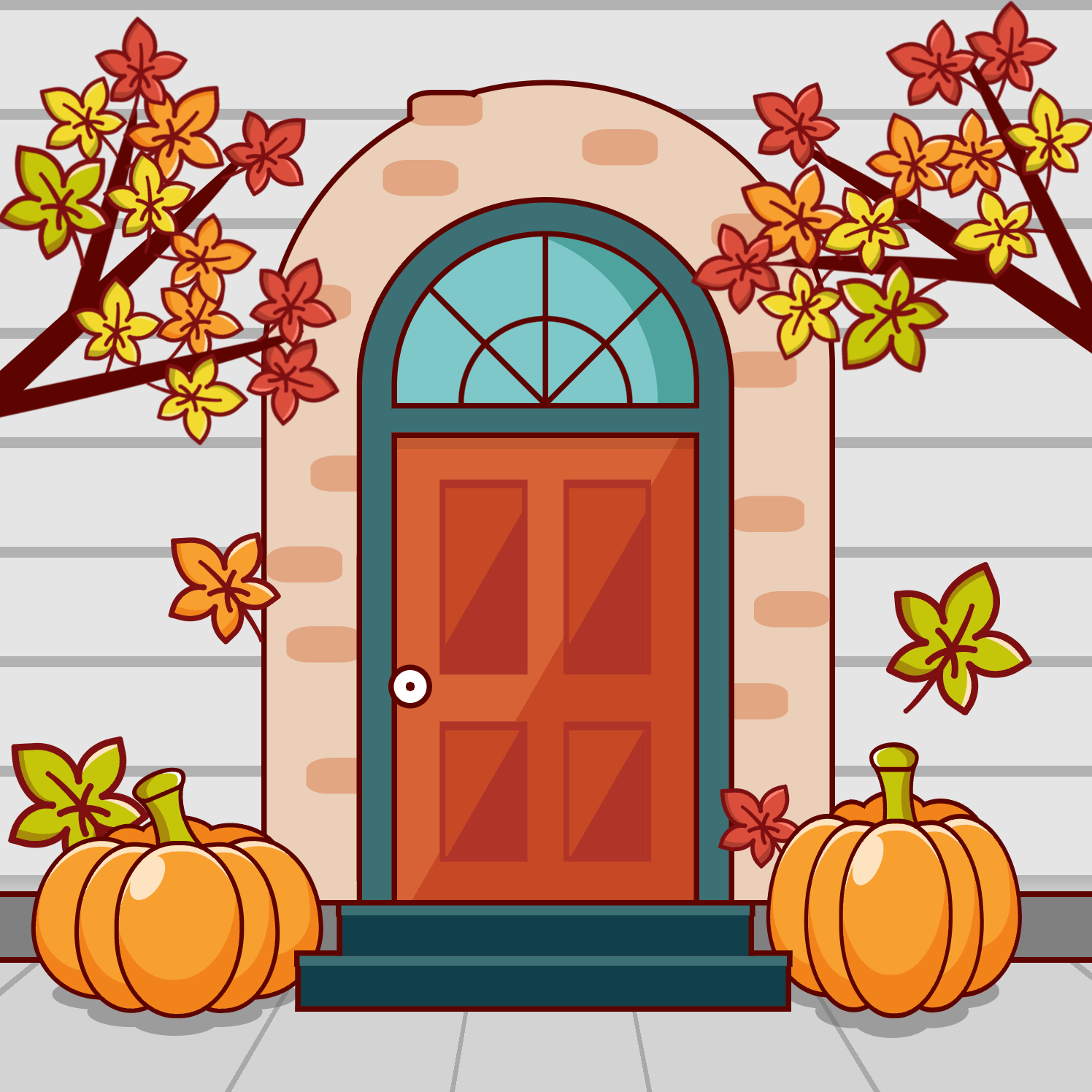
The Branches
Add a few branches with this markup
<div class="branch left">
  <div class="leaf green">
    ... leaf markup ...
  </div>
  <div class="leaf yellow">
    ... leaf markup ...
  </div>
  <div class="leaf red">
    ... leaf markup ...
  </div>
  ... as many as you need ...
</div>
and this CSS. Then position your leaves along the branch.
.branch {
  background-color: var(--outline);
  width: 30px;
  height: 500px;
  border-top-right-radius: 100%;
  position: absolute;
  top: 419px;
  left: 416px;
  z-index: 5;

  &:after {
    content: "";
    width: 20px;
    height: 300px;
    background-color: var(--outline);
    border-top-right-radius: 100%;
    position: absolute;
    top: 56px;
    left: 82px;
    transform: rotate(30deg);
  }

  &:before {
    content: "";
    width: 20px;
    height: 200px;
    background-color: var(--outline);
    border-top-right-radius: 100%;
    position: absolute;
    top: 30px;
    left: -50px;
    transform: rotate(-30deg);
  }
}
The Trick
It looks good, but let’s let our visitors ring a doorbell to trick-or-treat this house!
.doorbell {
  width: 15px;
  height: 45px;
  background-color: lightgray;
  position: absolute;
  top: 549px;
  left: 338px;
  border-radius: 2px;
  box-shadow: 0px 2px 0 2px rgba(0, 0, 0, .2);
  cursor: pointer;
  z-index: 2;

  &:after {
    content: "";
    width: 10px;
    height: 25px;
    background-color: goldenrod;
    position: absolute;
    top: 50%;
    left: 50%;
    transform: translate(-50%, -50%);
    box-shadow: 0px 1px 0 1px rgba(0, 0, 0, .2);
  }

  &:hover {
    background-color: white;
    &:after {
      background-color: gold;
    }
  }
}
And now it’s complete! Now ring that doorbell, and see if you get tricked or treated!

Conclusion
You can view the Trick or Treat CSS Example Page where you can inspect and fiddle with the source code, or you can check out the Trick or Treat CSS repo on Github.