CSS-only Jigsaw Puzzle

This post is inspired by this week’s CodePen Challenge: “Puzzle Play”.
Somewhere in my house, at any point in time (to my wife’s annoyance) lays a partially finished jigsaw puzzle. It’s not that I don’t finish the puzzles, but rather I start a new one as soon as the last piece completes a picture. I have wooden jigsaws, custom printed jigsaws, dozens of Ravensburgers, some I collected while traveling and many were given as gifts (easy to shop for :). I even have a custom dining room table with a transparent top to display some of my recently completed masterpieces.
So, naturally this CodePen challenge made me think of Jigsaw Puzzles. I’ve written several Javascript-based jigsaw puzzle libraries that take an image and mask out piece shapes which can then be dragged into position. Could this be done with pure CSS? Yes!-ish.
This builds on some concepts discussed in CSS-only Tic-Tac-Toe and CSS-only Carousel. Both use hidden checkboxes or radio buttons to maintain state. The inputs are selected by the user through interacting with label tags. Since CSS can select based on the checked status of an input, we can define styles based on the overall state.
Depending on the size of the puzzle, yes, that’s a lot of state. More on that later…
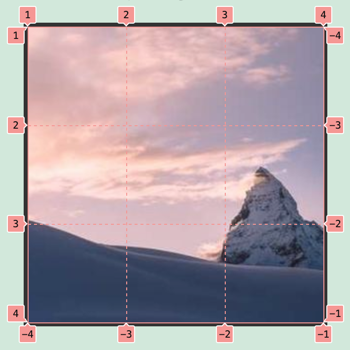
The Image
We’ll snag an image from Picsum. The neato thing about Picsum is you can request a specific size via URL, and it will return a random image from their collection sized at that size! You can request specific images, filter images with grayscale or blur, request specific image formats and more. Great for prototyping.
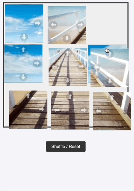
Anyway, we’ll grab an image and cut it up into a 3x3 puzzle. Why so small? You’ll see :)
Hint: 9 pieces, 9 possible positions = 81 radio buttons!
We’ll be using SLIM:
.jigsaw-gameAnd SCSS since there’s going to be a LOT of nearly duplicate elements and styles:
$grid-size: 3;
$cell-size: 100px;
$total-size: $cell-size * $grid-size;

.jigsaw-game {
  position: relative;
  width: $total-size;
  height: $total-size;
  margin: 20px auto;
  border: 4px solid #333;
  background: #eee;
  display: grid;
  grid-template-columns: repeat($grid-size, 1fr);
  grid-template-rows: repeat($grid-size, 1fr);
  background-image: url('https://picsum.photos/300/300'); // Default placeholder
  background-size: ($grid-size);
}
The Logic
Since we don’t have the luxury of randomization in all browsers, we’ll predefine where each piece will start e.g. [4, 0, 8, 2, 7, 1, 3, 5, 6]. Then we’ll create radio buttons to keep track of each piece’s position. By keeping track of where each piece is (based on the selected radio button), we can determine which directions that piece is allowed to move it, and show/hide arrows accordingly.
The Pieces
Let’s cut up the picture next and add these radio buttons. We’ll create 9 divs each with the same background image, but with the background image offset so only 1/9 of the image is visible.
Here’s the SLIM update
- shuffled = [4, 0, 8, 2, 7, 1, 3, 5, 6]

- (0..8).each do |p|
  - (0..8).each do |pos|
    input.jigsaw-radio type="radio" name="p#{p}" id="p#{p}-#{pos}" checked=(shuffled[p] == pos)

.jigsaw-game
  - (0..8).each do |p|
    div class="piece p#{p}"
And the .piece SCSS
.piece {
  position: absolute;
  width: $cell-size;
  height: $cell-size;
  transition: transform 0.3s ease, opacity 0.3s ease, margin 1s ease, width 1s ease, height 1s ease;
  z-index: 10;
  cursor: pointer;
  box-sizing: border-box;
  border: 1px solid rgba(255, 255, 255, 0.3);
  background-image: url('https://picsum.photos/300/300'); // Default placeholder
  background-size: ($grid-size * 100%) ($grid-size * 100%);
}
This gives us 9 square divs, but we need some serious loops and styles to assign each piece a part of the image
@for $p from 0 through 8 {
  @for $pos from 0 through 8 {
    $row: floor($pos / $grid-size);
    $col: $pos % $grid-size;

    #p#{$p}-#{$pos}:checked ~ .jigsaw-game .p#{$p} {
      transform: translate($col * $cell-size, $row * $cell-size);
      $orig-row: floor($p / $grid-size);
      $orig-col: $p % $grid-size;
      background-position: ($orig-col * 100% / ($grid-size - 1)) ($orig-row * 100% / ($grid-size - 1));
    }
  }
}
We need to keep track of the original row and column so we can draw the correct part of the image on the piece. When the page renders, the pieces are already shuffled in the DOM, so the top left corner piece may be in the lower right corner.
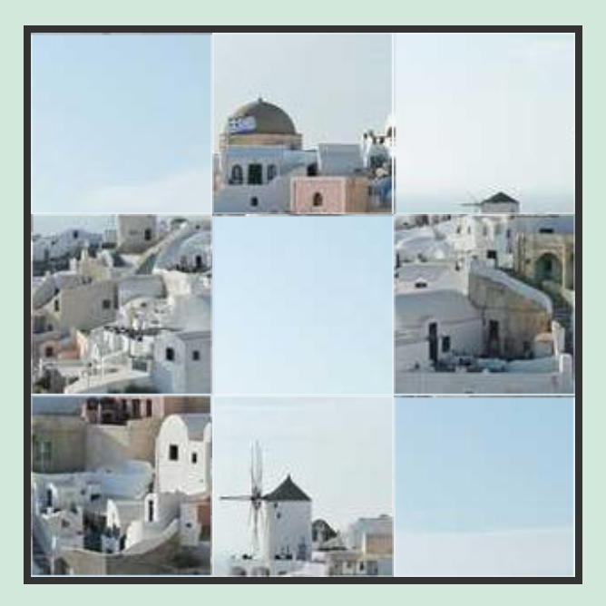
That’s pretty puzzle-ish!
Moving Pieces
I really wanted to use HTML5 draggable but there’s no way to maintain or set state after a drag operation without Javascript, so it’s out. We’ll fall back to normal, clickable labels that set the appropriate radio button. There is a radio button for each piece in each position, so we will always know exactly where the piece is, and can deduce from that where it can move to. However, that means that each piece must have a ‘MOVE UP’ unique for EVERY position the piece could be in.
This adds all the arrows to all the pieces (one arrow for every possible position the piece could be moved to):
...
- (0..8).each do |p|
  div class="piece p#{p}"
    - (0..8).each do |pos|
      label.move-up for="p#{p}-#{pos}" ⬆
      label.move-down for="p#{p}-#{pos}" ⬇
      label.move-left for="p#{p}-#{pos}" ⬅
      label.move-right for="p#{p}-#{pos}" ⮕
And this adds the styles to only show the valid arrows:
.piece {
  ...

  // Directional buttons
  label {
    display: none;
    position: absolute;
    width: 30px;
    height: 30px;
    background: rgba(0,0,0,0.2);
    color: white;
    text-align: center;
    line-height: 30px;
    font-size: 20px;
    border-radius: 50%;
    z-index: 20;
    cursor: pointer;
    user-select: none;
    opacity: 0.6;

    &:hover {
      background: rgba(0,0,0,0.8);
    }
  }

  .move-up    { top: 5px; left: 50%; transform: translateX(-50%); }
  .move-down  { bottom: 5px; left: 50%; transform: translateX(-50%); }
  .move-left  { left: 5px; top: 50%; transform: translateY(-50%); }
  .move-right { right: 5px; top: 50%; transform: translateY(-50%); }
}

@for $p from 0 through 8 {
  @for $pos from 0 through 8 {
    $row: floor($pos / $grid-size);
    $col: $pos % $grid-size;

    #p#{$p}-#{$pos}:checked ~ .jigsaw-game .p#{$p} {
      transform: translate($col * $cell-size, $row * $cell-size);
      $orig-row: floor($p / $grid-size);
      $orig-col: $p % $grid-size;
      background-position: ($orig-col * 100% / ($grid-size - 1)) ($orig-row * 100% / ($grid-size - 1));

      // Up
      @if $row > 0 {
        .move-up[for="p#{$p}-#{$pos - 3}"] { display: block; }
      }
      // Down
      @if $row < 2 {
        .move-down[for="p#{$p}-#{$pos + 3}"] { display: block; }
      }
      // Left
      @if $col > 0 {
        .move-left[for="p#{$p}-#{$pos - 1}"] { display: block; }
      }
      // Right
      @if $col < 2 {
        .move-right[for="p#{$p}-#{$pos + 1}"] { display: block; }
      }
    }
  }
}
This ensures that each piece has a label arrow for each allowable direction in each possible position - so 36 labels per piece! That’s a lot of labels.
Clicking a label will move the piece in that direction (as the radio button coorelating to that piece in that position is the visible label). Since we have styles that position the piece correctly based on radio button checked-ness, the piece pops into the slot. Now it’s a solvable puzzle!!…
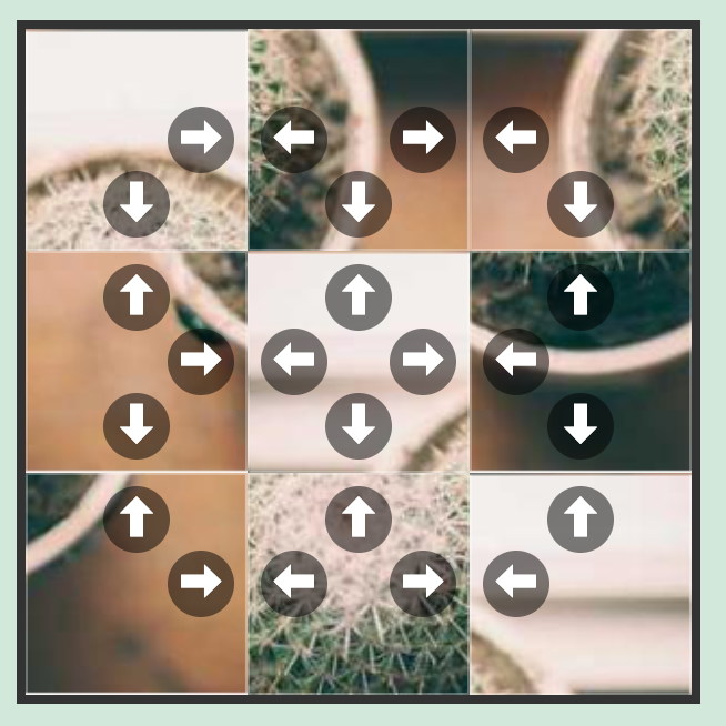
Except for the stacked pieces… If you’re following along, you’ll quickly see that the pieces stack behind eachother. It’s so easy to lose a piece (kinda like real life, I guess)!
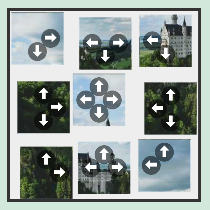
Solving Stacks
I wasn’t sure what to do about the stacked pieces. At first I thought maybe I’d have them swap places with their adjacent piece, but that was even MORE state to keep track of. And it would seem like a hybrid 15-slide/jigsaw puzzle, not a free-moving jigsaw.
In the end, I decided to shrink the pieces down a few pixels, and give them a little offset so you can see how many pieces are stacked up at any square. It turned out to be a pretty easy update:
@for $p from 0 through 8 {
  .p#{$p} {
    // Add a tiny offset so stacked pieces are visible
    margin-top: $p * 3px;
    margin-left: $p * 3px;
    width: $cell-size - 10px;
    height: $cell-size - 10px;
  }
}
And then you can remove the background image from the play area in the CSS.
Detecting Completion
The biggest downside to this approach is that the ‘mixing’ of the pieces is predefined. You could have a bunch of puzzle pages that each have a different mixing and picture, but this post is long enough!
The premix makes it easy to know the completed position though! Once every radio button for each pieces in the correct piece position is checked:
body:has(#p0-0:checked):has(#p1-1:checked)... ... ... {
  .win-message { display: block; }
}
Then we know each piece is exactly in the right place! We’ll use :has for brevity in this post, but we could have used sibling selectors to make sure the win-state is met (like we did on previous posts).
.jigsaw-radio {
  display: none;
}

.win-message {
  display: none;
  background: white;
  padding: 2rem;
  border: 4px solid #4CAF50;
  box-shadow: 0 0 50px rgba(0,0,0,0.5);
  z-index: 100;
  text-align: center;

  h2 { color: #4CAF50; margin-top: 0; }
}

body:has(#p0-0:checked):has(#p1-1:checked):has(#p2-2:checked):has(#p3-3:checked):has(#p4-4:checked):has(#p5-5:checked):has(#p6-6:checked):has(#p7-7:checked):has(#p8-8:checked) {
  .win-message {
    display: block;
  }
  .jigsaw-game {
    pointer-events: none;
  }
  & > .controls {
    display: none;
  }
  .piece {
    width: $cell-size !important;
    height: $cell-size !important;
    margin-top: 0px !important;
    margin-left: 0px !important;
    margin-right: 0px !important;
    margin-bottom: 0px !important;
  }
  .piece label {
    opacity: 0.2;
  }
}
And the final SLIM:
.win-message
  h2 🎉 Congratulations!
  p You've solved the puzzle using nothing but CSS!
  .controls
    a.btn-reset href="" Play Again

.controls
  a.btn-reset href="" Shuffle & Reset
This shows a box when you complete the puzzle, sets the size of the pieces to their full size (to close all the gaps), and allows the user to play again.
Since some of the image from Picsum are patterns, they are very difficult to solve. We added a button to allow the user to cycle to a new image.
Conclusion
You can view the CSS-Only Jigsaw Puzzle Example Page where you can inspect and fiddle with the source code, or you can check out the CSS-Only Jigsaw Puzzle repo on Github. If you want to play with the code live, you can visit the CSS-Only Jigsaw Puzzle on CodePen.